Aloha!
ʕ•̫͡•
Aloha! ʕ•̫͡•
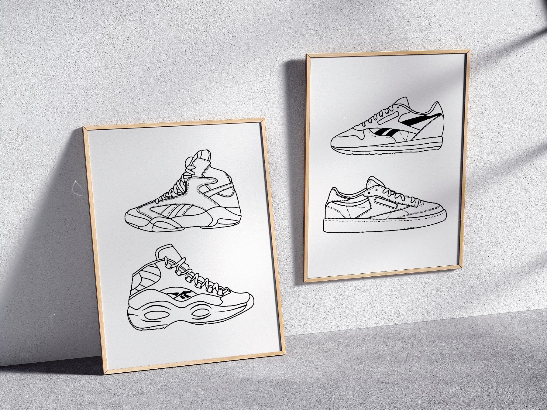
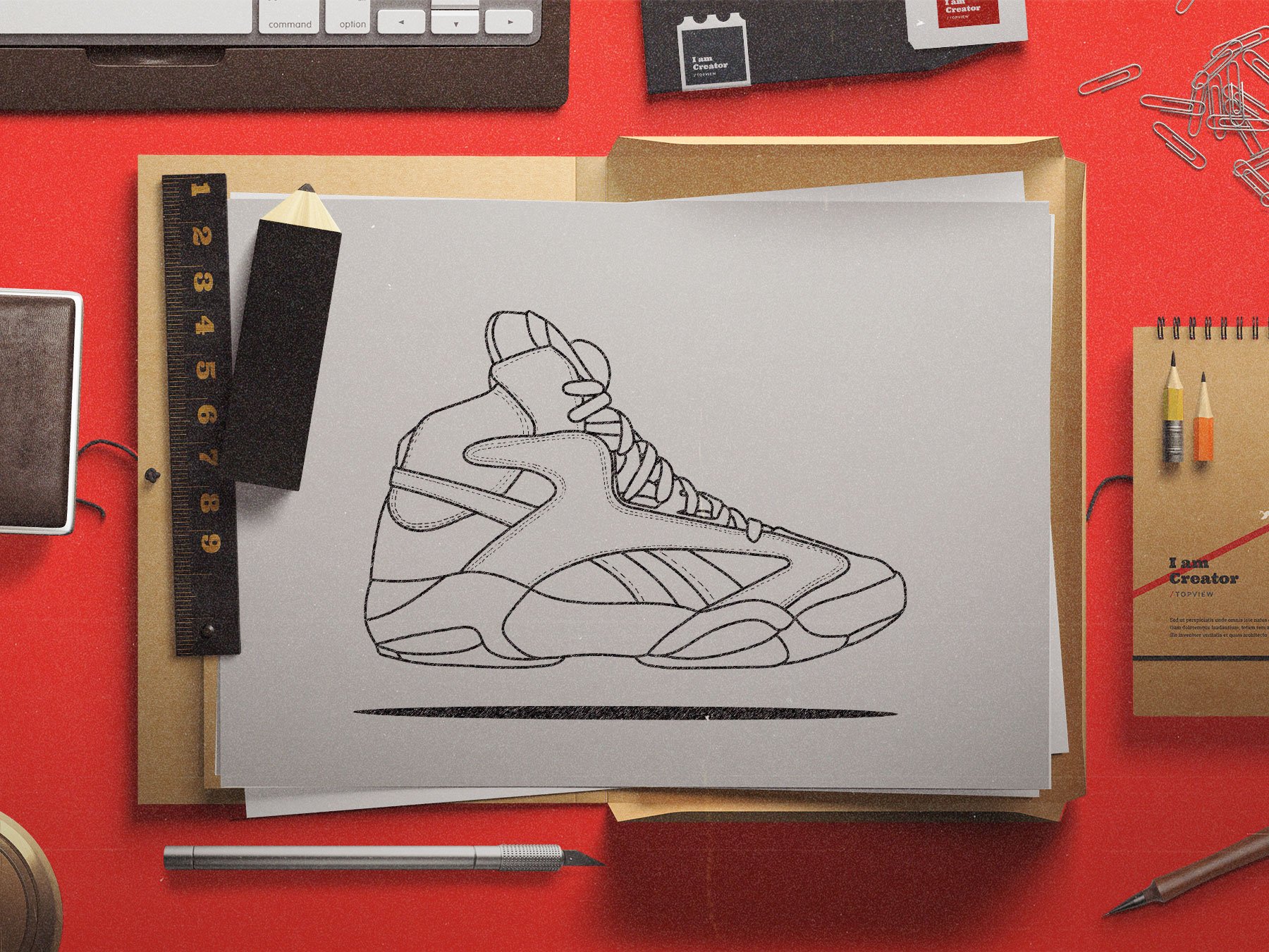
Reebok
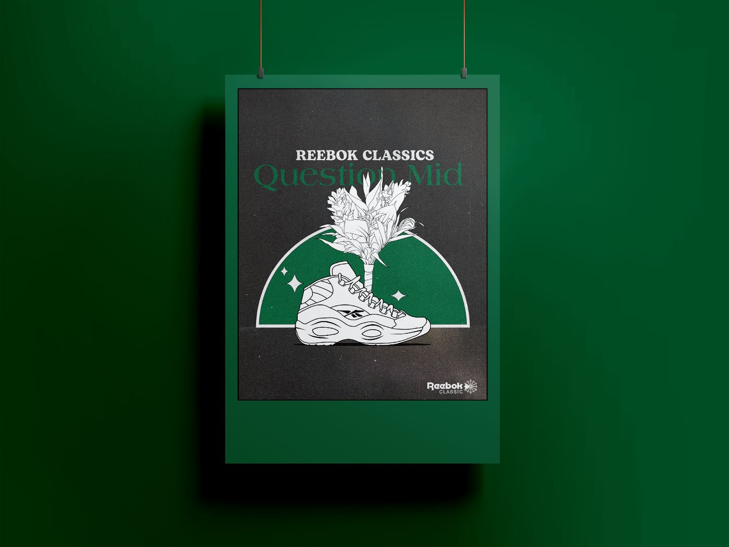
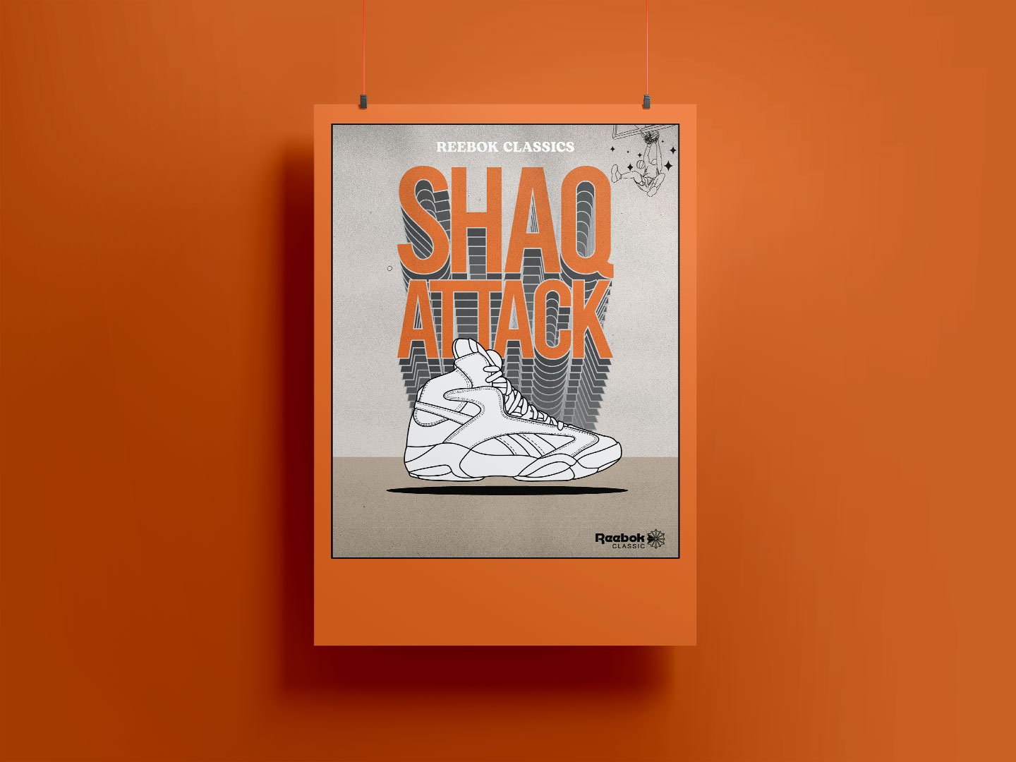
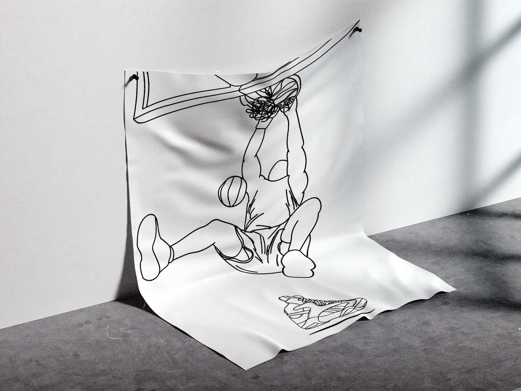
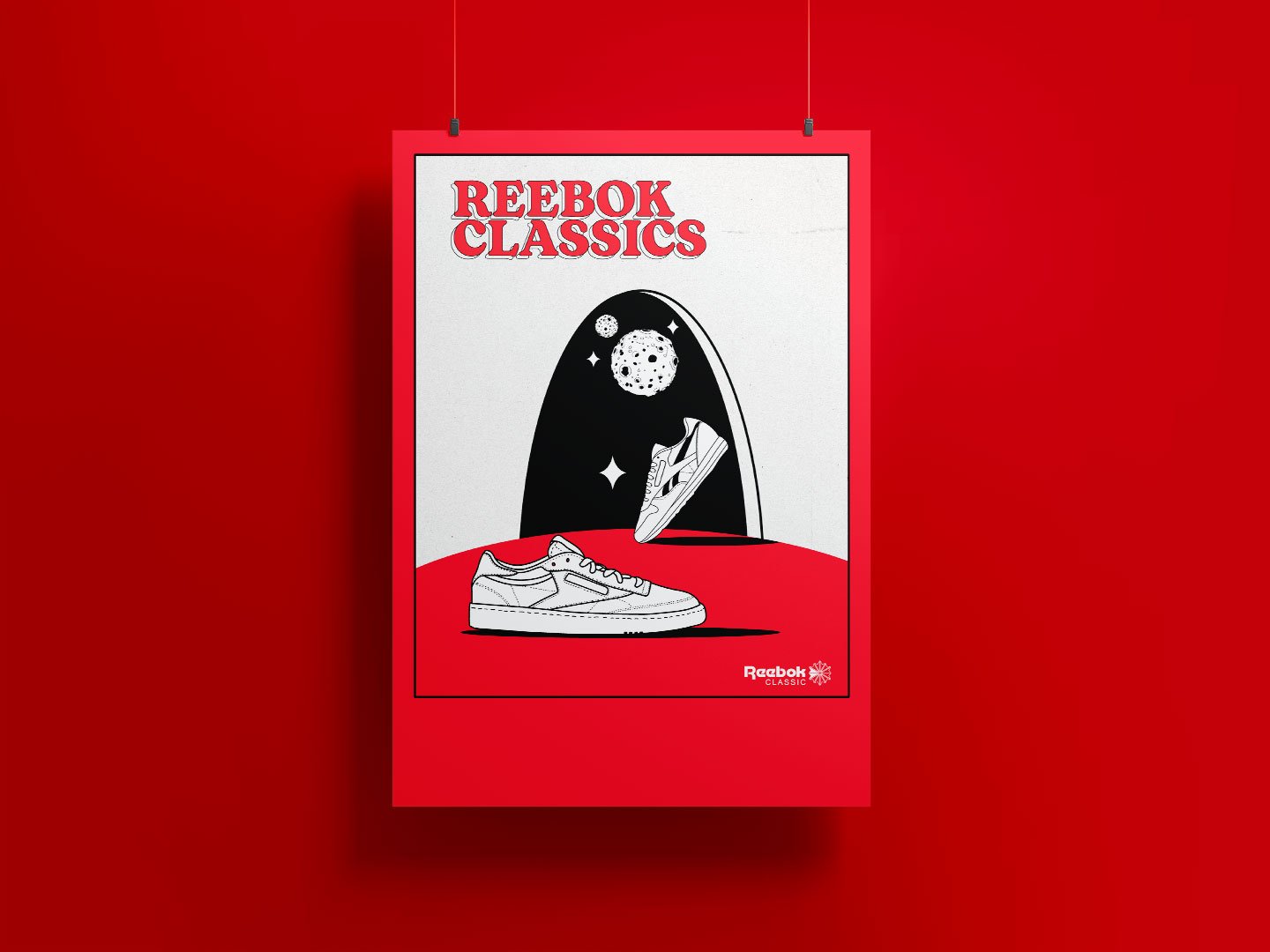
Reebok Classics Vintage Posters & Illustrations
This is a Reebok Classics creative exploration that presents the classic line of sneakers in vintage style. Each of the iconic shoe silhouettes and other illustrations were drawn in Adobe Illustrator.
The focus of the designs are to advertise each shoe as a throwback.
Tools used:
Illustrator
view more on BEHANCE

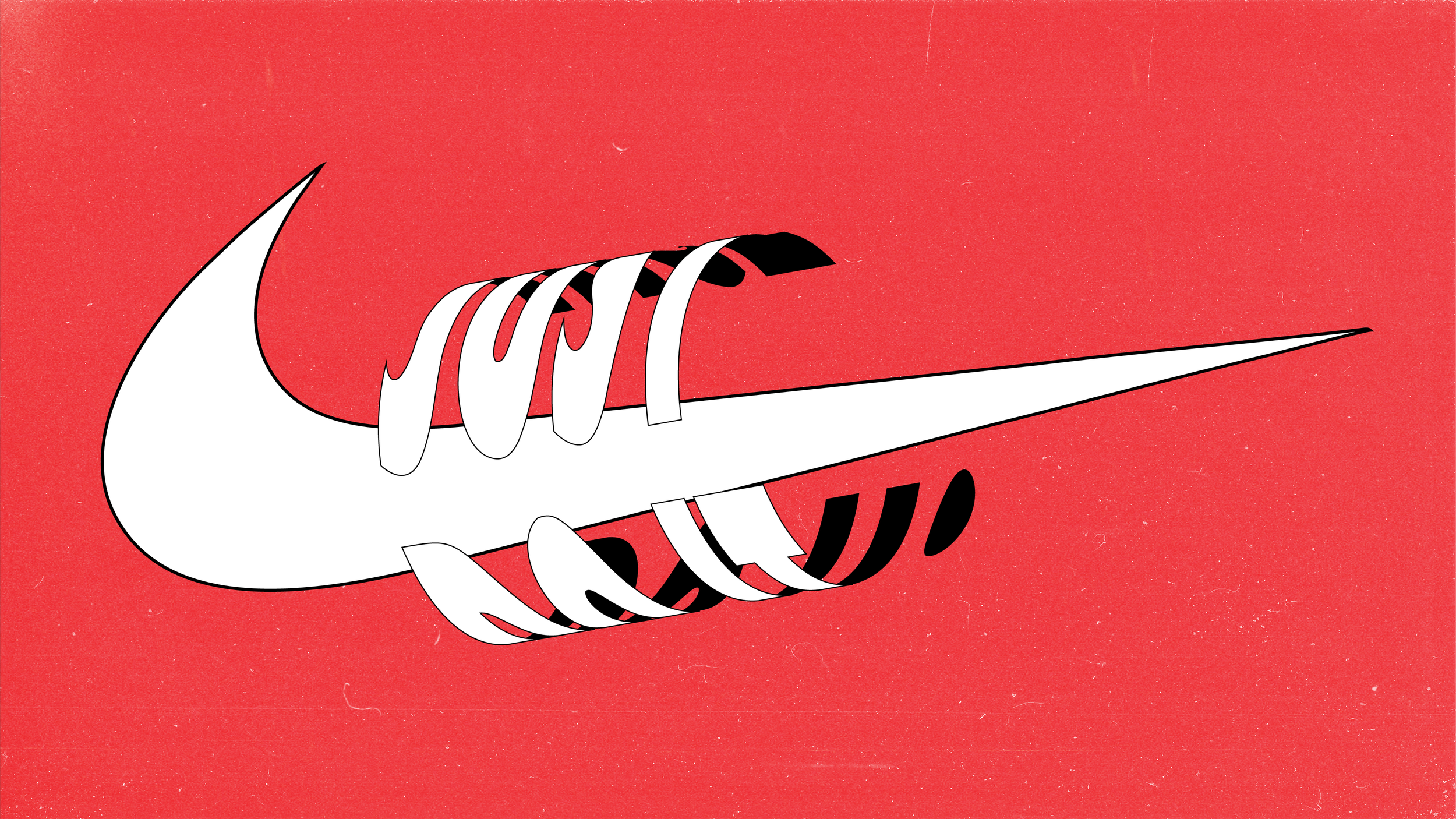

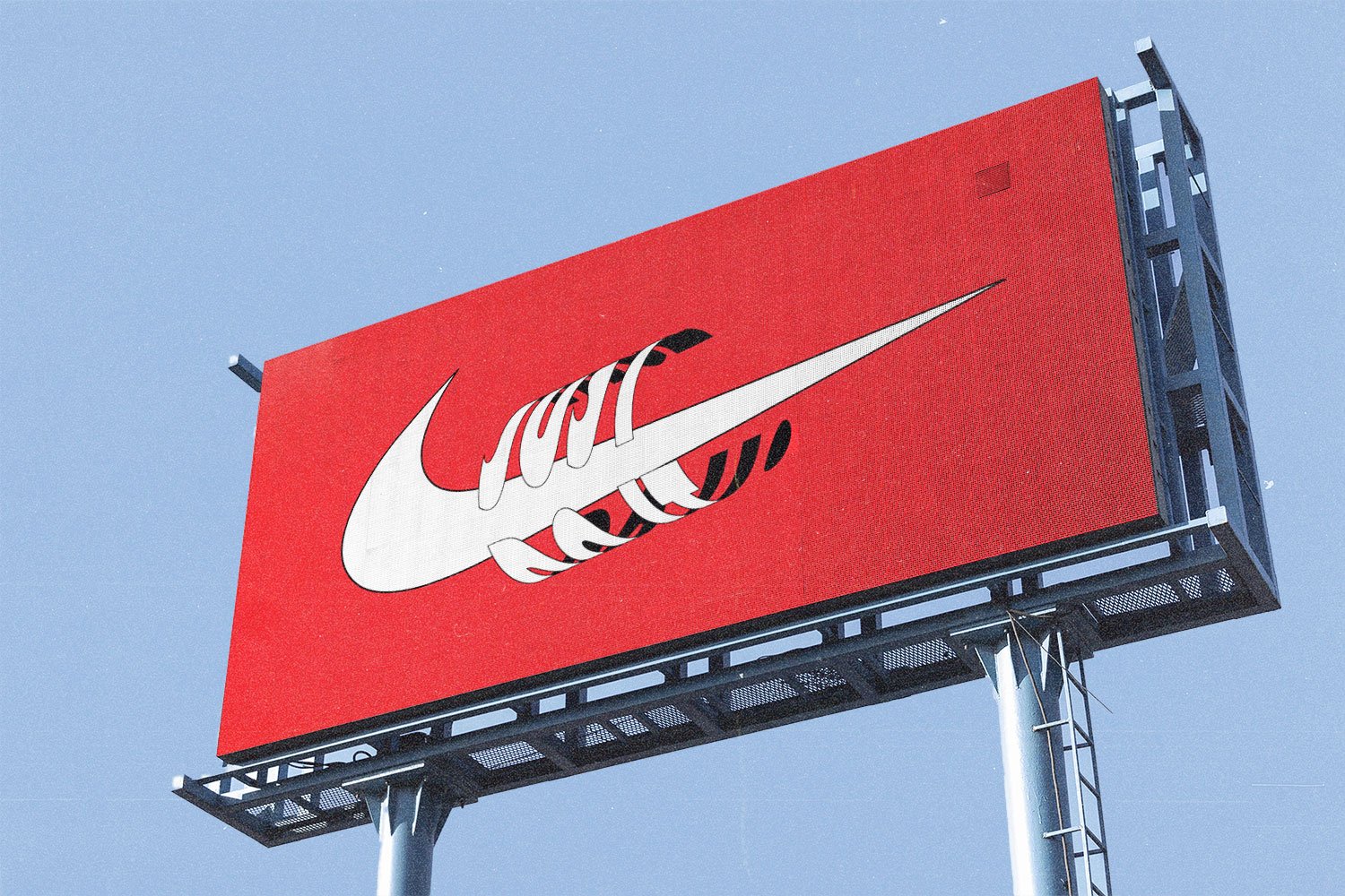

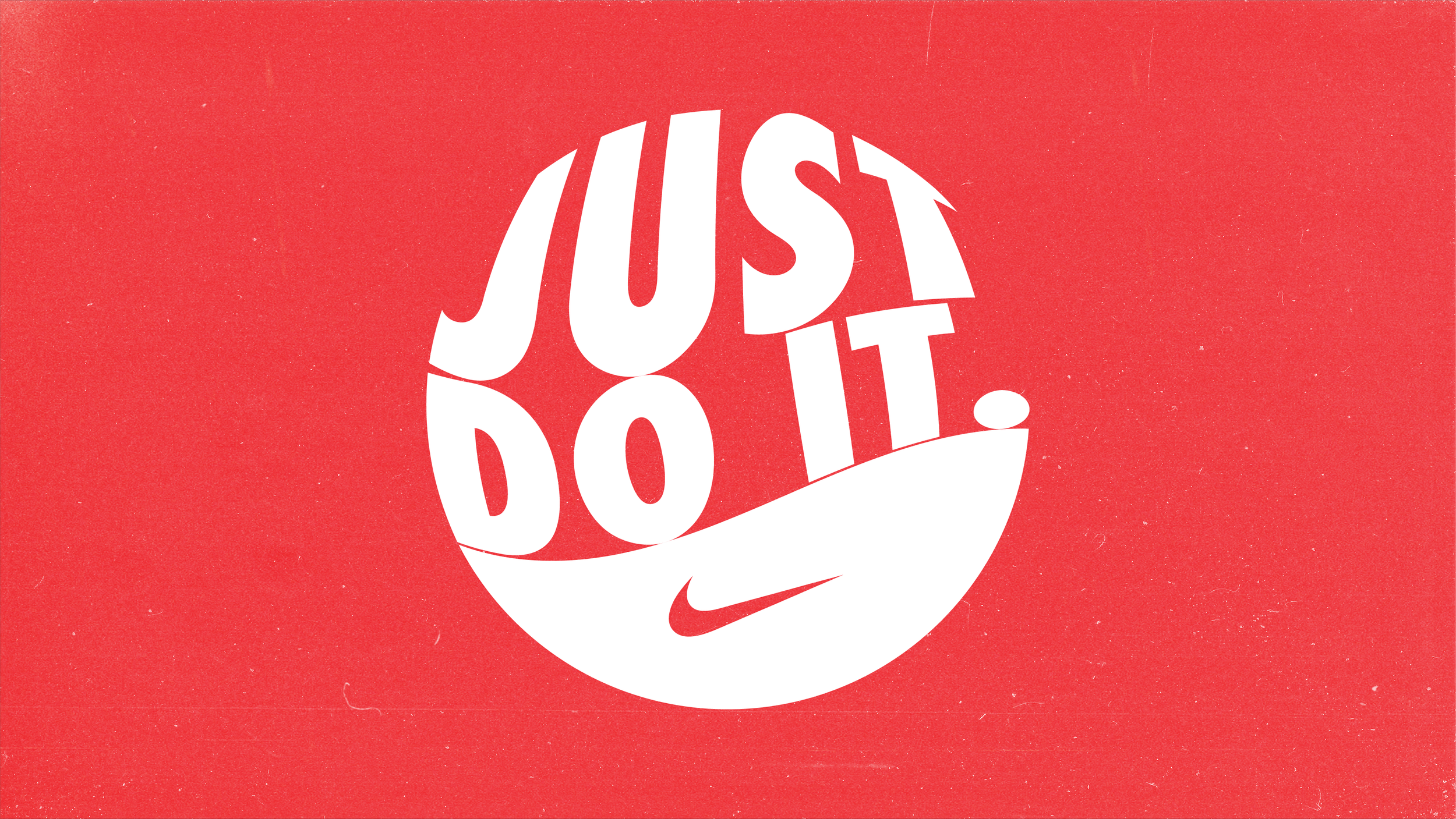

Nike
Just Do It - creative explorations
These selected works are from a creative exercise stylizing Nike logo, Just Do it branding and Jordan Brand iconography in a creative and dynamic way. Each design is merely a free form exploration that was not bound by any rules or standards apart from a perceived feeling towards the global Nike brand.
Tools used:
Illustrator
view more on BEHANCE
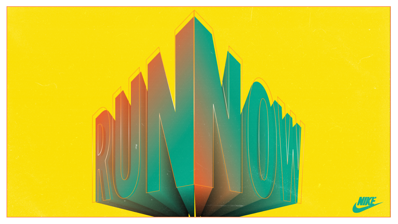
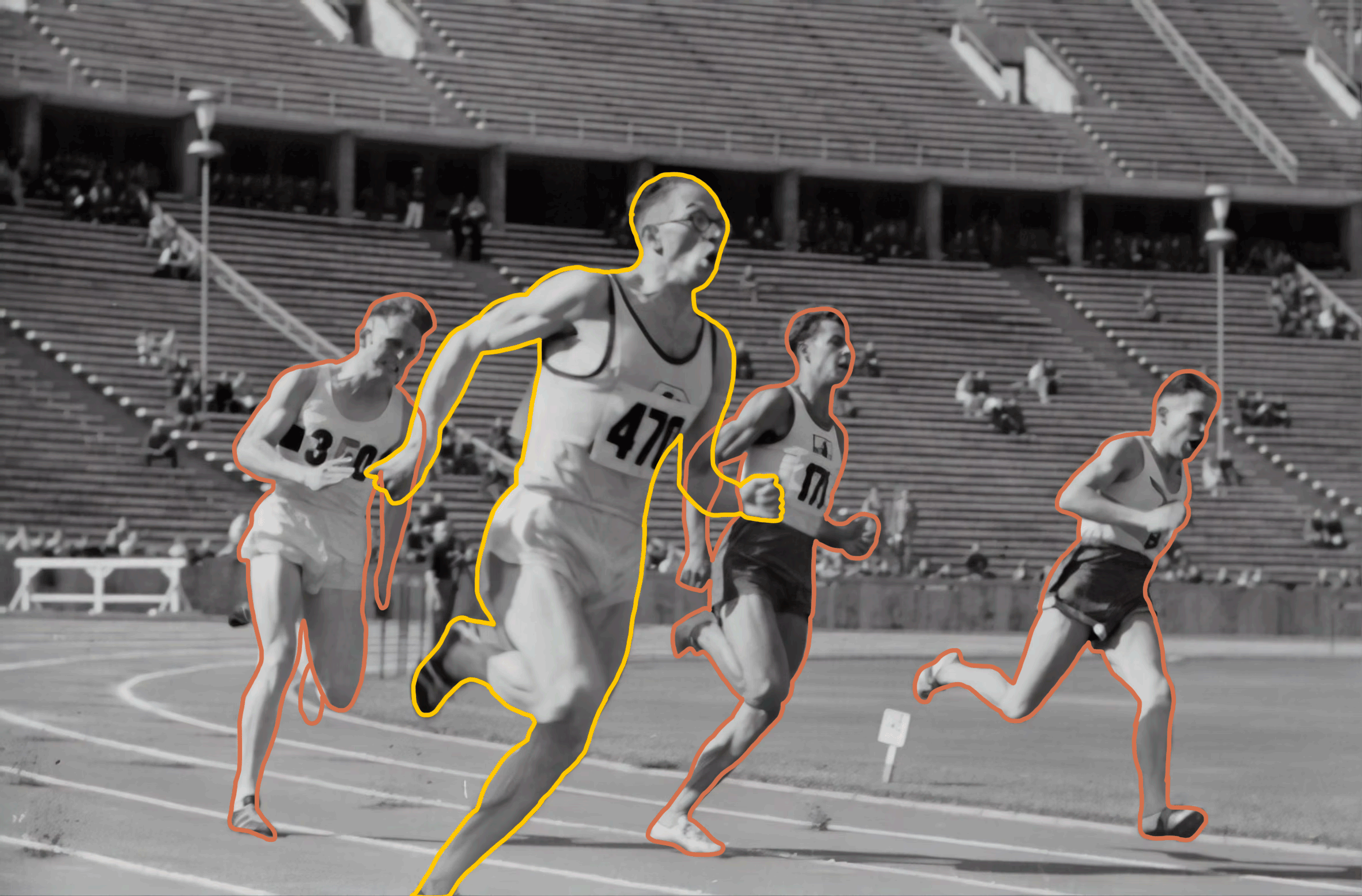

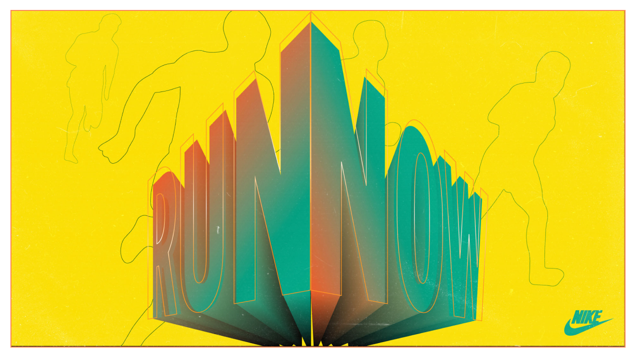
Nike
RUN NOW AD CAMPAIGN (creative exploration)
For this design exploration - I created a "Run Now" Graphic Art Campaign under the Nike banner. The main intention was to create a very bold and dynamic typeface that initiates an immediate impact on the viewer. Centered and protruding out to of the canvas to stimulate the user to grasp the messaging. Coupled with running silhouettes, to add a sense of movement, the following explores three options as presented design alternatives.
Tools used:
Photoshop
Illustrator
view more on BEHANCE


Reebok
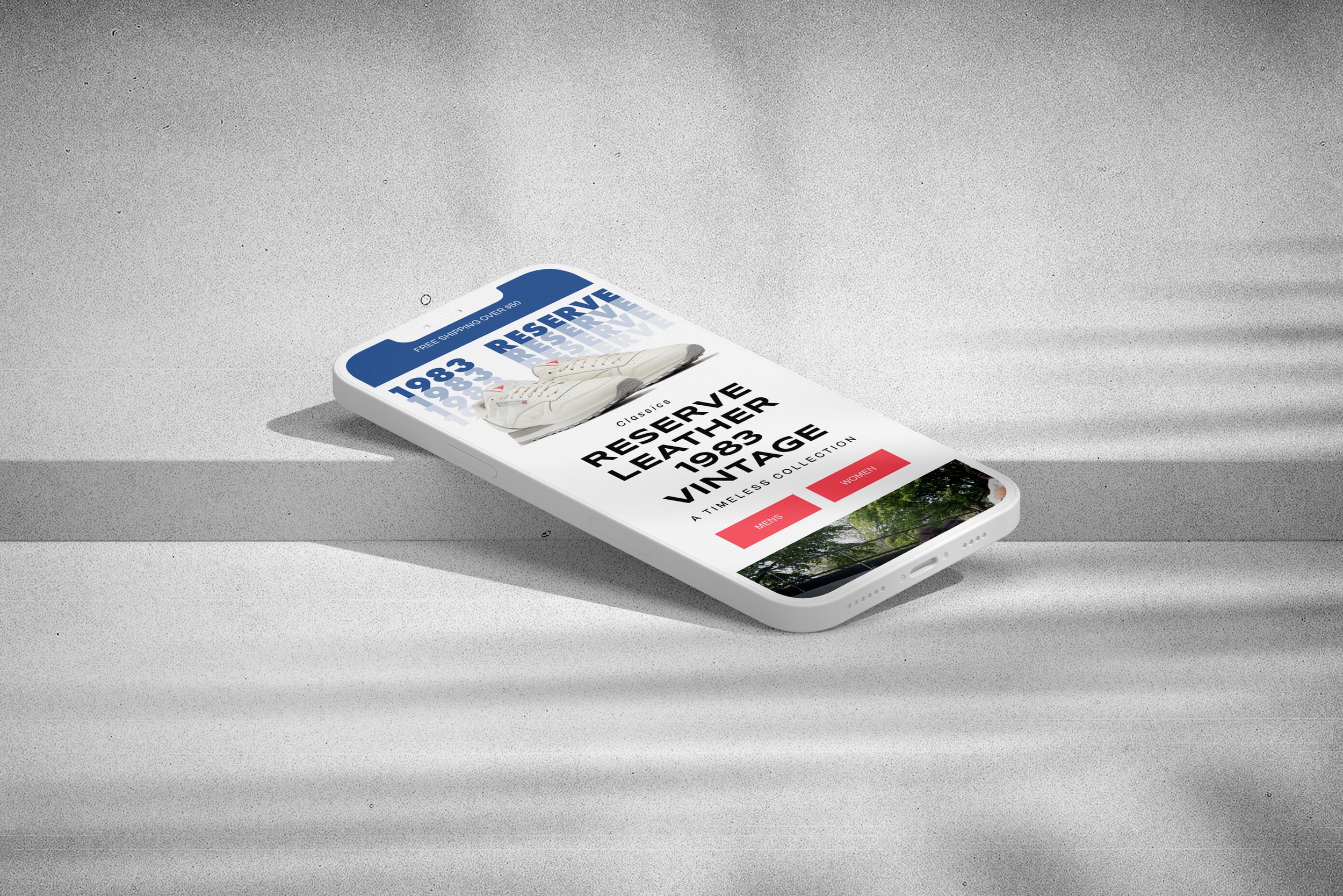
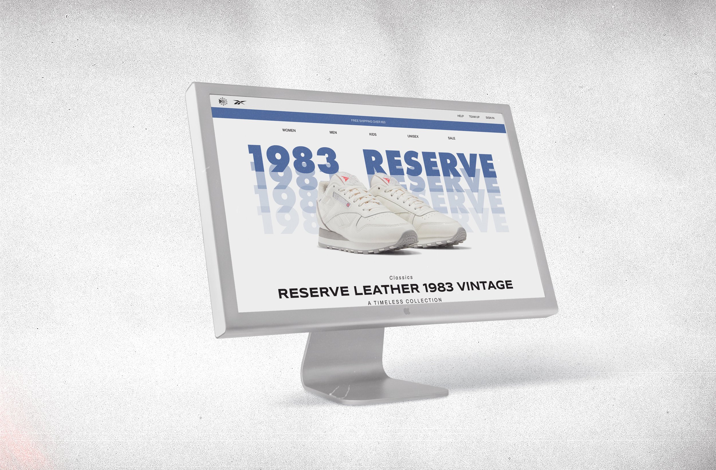
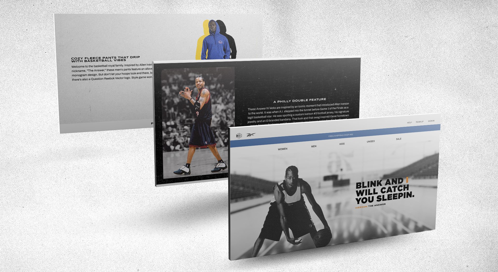
Reebok classics Desktop + Mobile online experience (creative exploration)
Reebok Classic is a lifestyle shoe brand that consists of athletic shoes that became popular casual wear. The brand evolved from the Classic Leather, the Workout, the Ex-O-Fit, the Newport Classic and the Freestyle. Reebok Classic also includes Retro Running, Retro Basketball, InstaPump Fury and contemporary styles. (source: wikipedia)
Since 1983, the Classics line for Reebok has developed a strong legacy in sports and fashion.
This is a creative exploration that aimed to develop desktop + mobile versions of what a dedicated online experience for the Reebok Classics brand and products.
Tools used:
Figma
Adobe Creative Suite
Photoshop
Illustrator
view more on BEHANCE
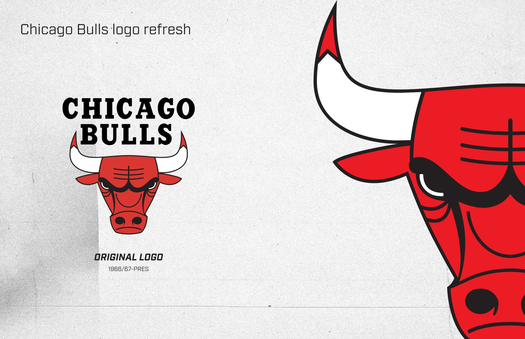
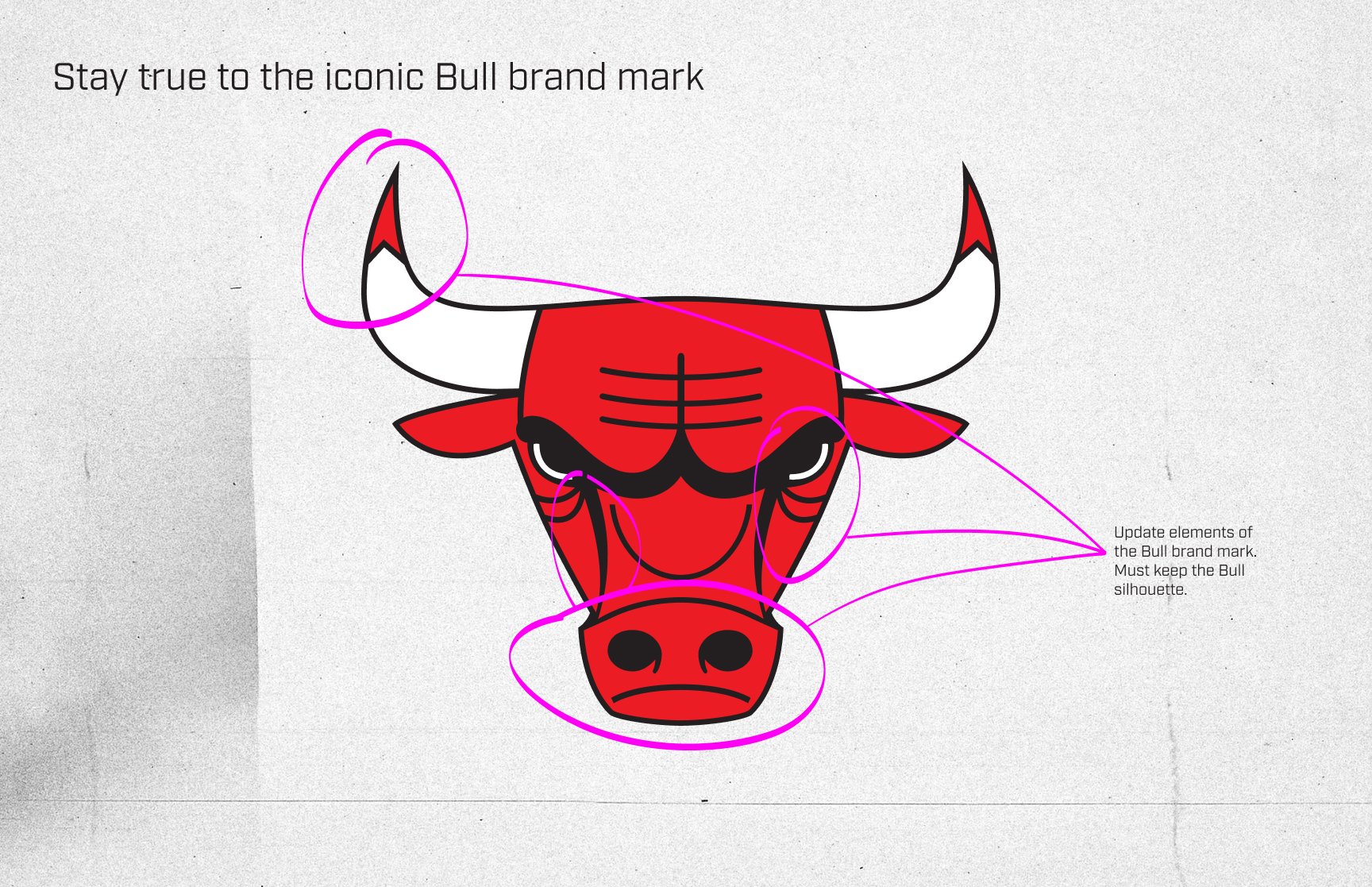
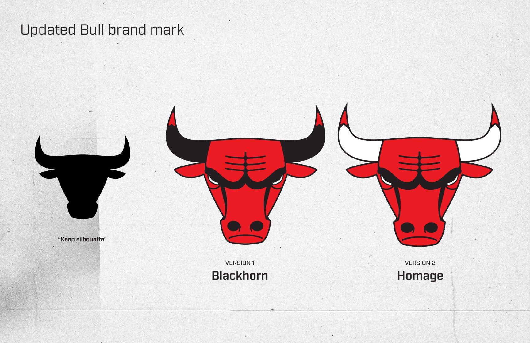
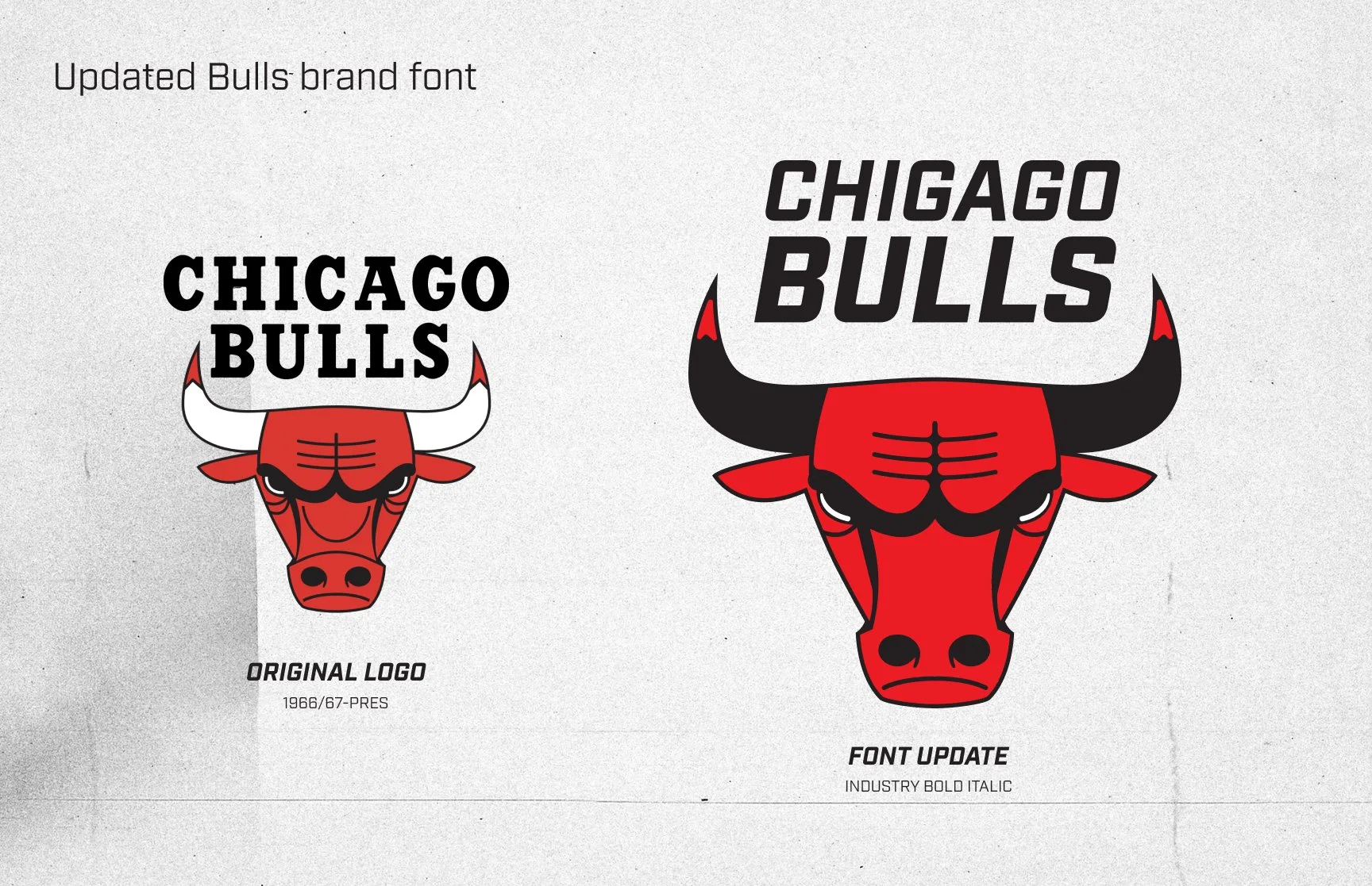
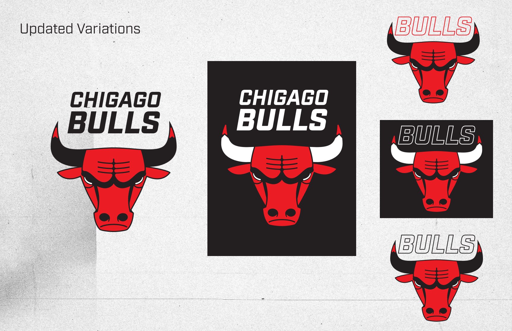


Chicago Bulls
Brand Logo Refresh
The Chicago Bulls is one of the most recognizable franchises in the NBA today. Their dominance in the 1990's winning six championships with Michael Jordan, Scottie Pippen and Phil Jackson. This is a personal creative exploration to slightly update the iconic logo. This idea explores an update that pays homage to the Bulls legacy, it doesn't reinvent the wheel but rather refines the current look for a modern day audience. The original/current Chicago Bulls logo has been used from 1966/67-Present. I wanted to update the brand mark in such a way where it would not deviate away from the lineage and core that the team has built for over 50 years.
Tools used:
Figma
Adobe Creative Suite
Photoshop
Illustrator
view more on BEHANCE

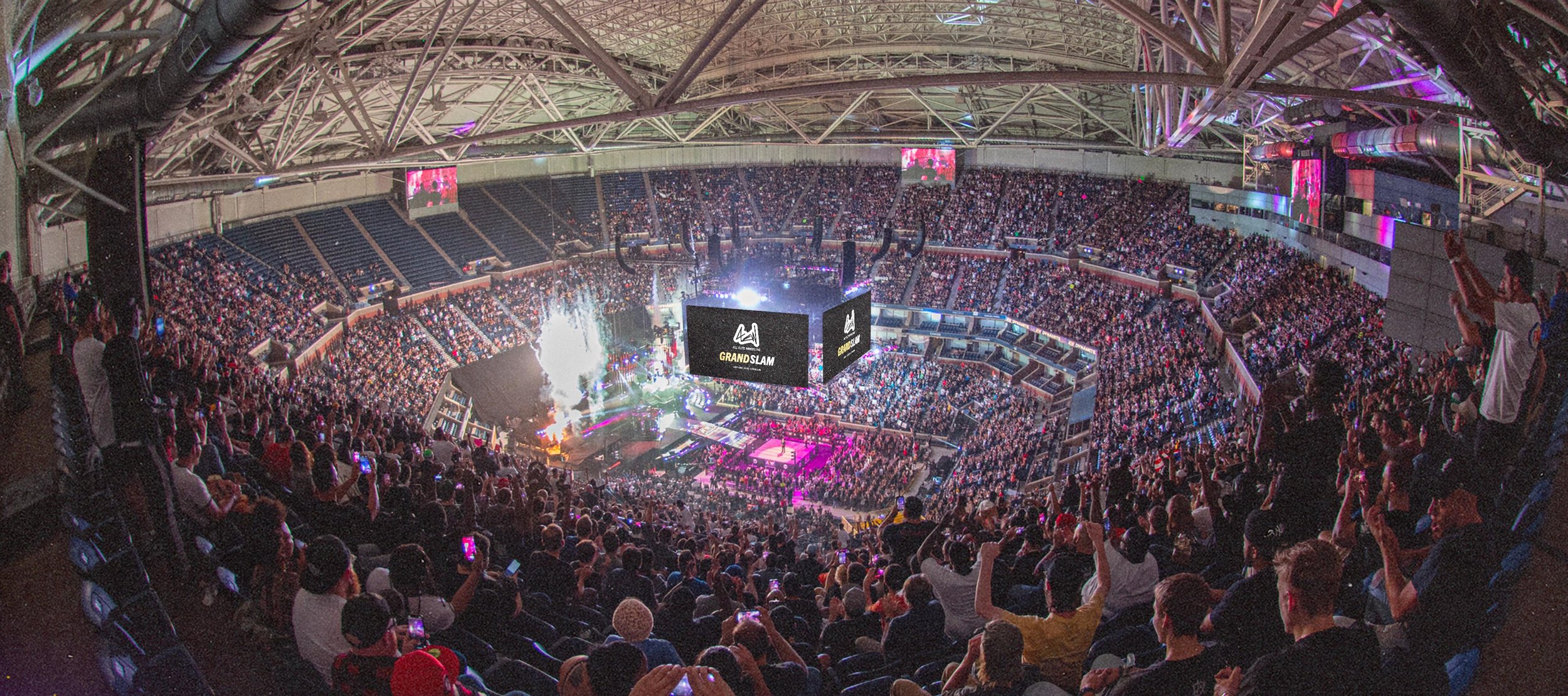
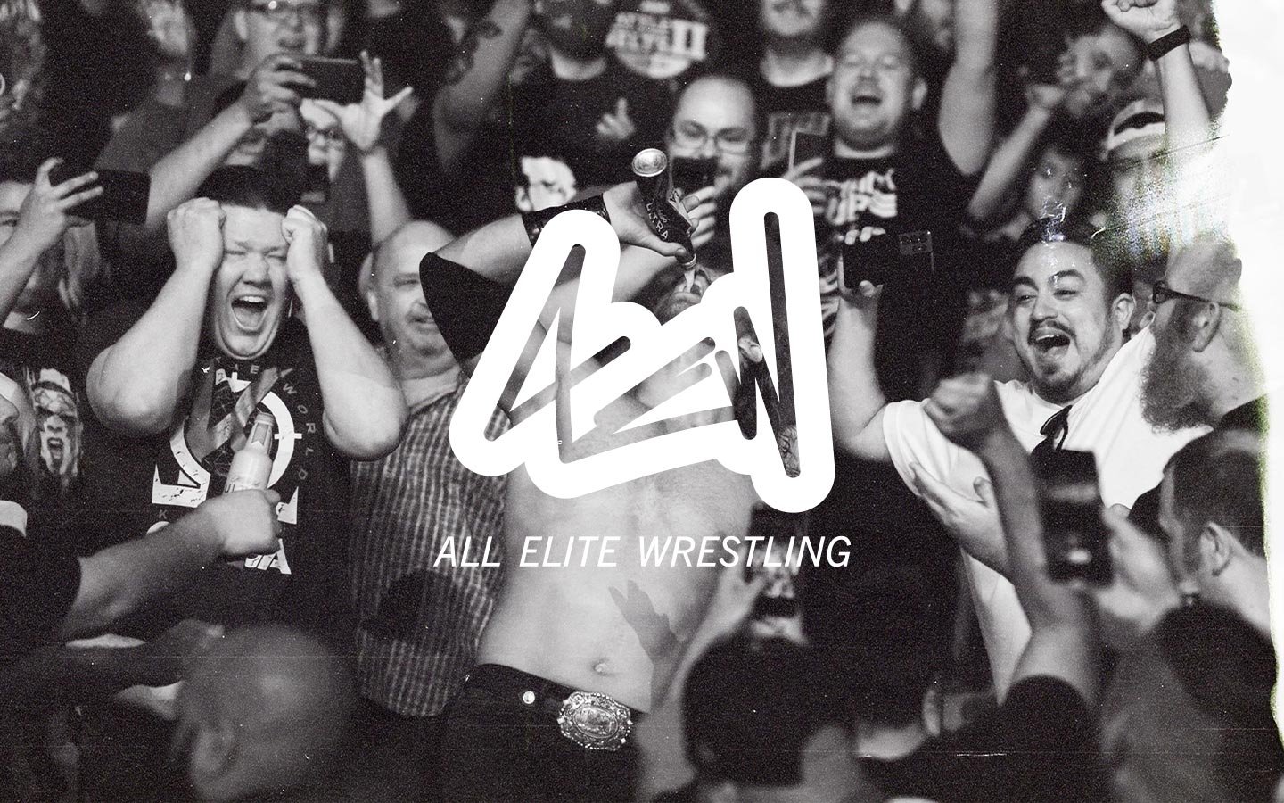
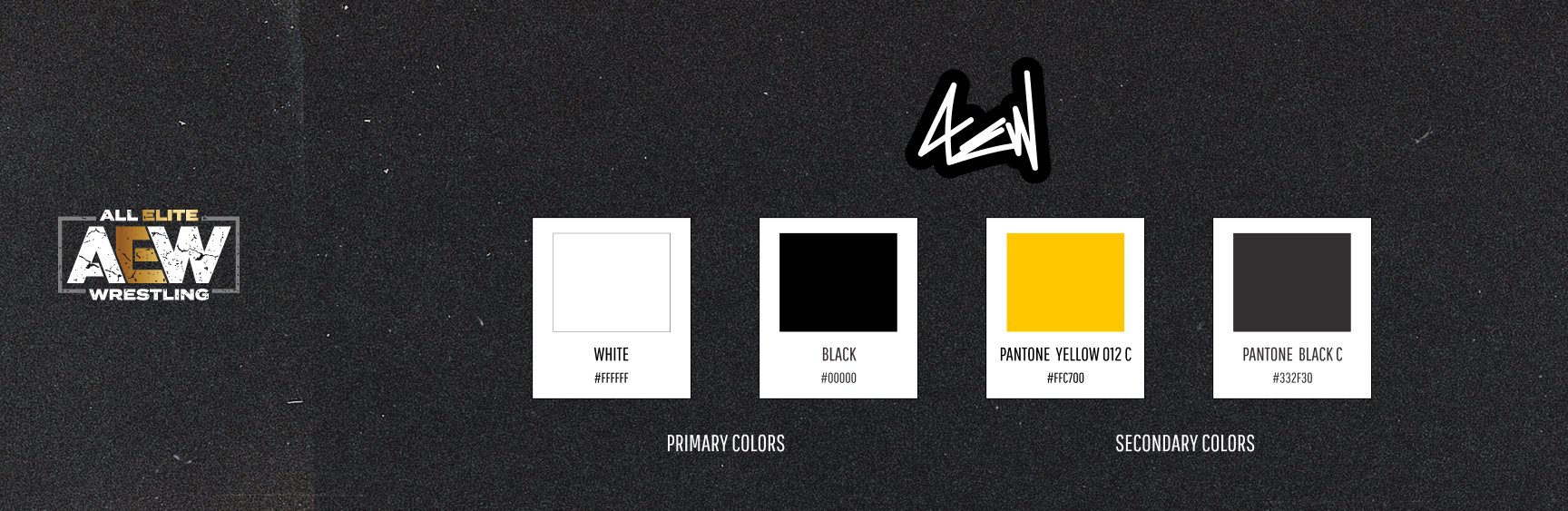
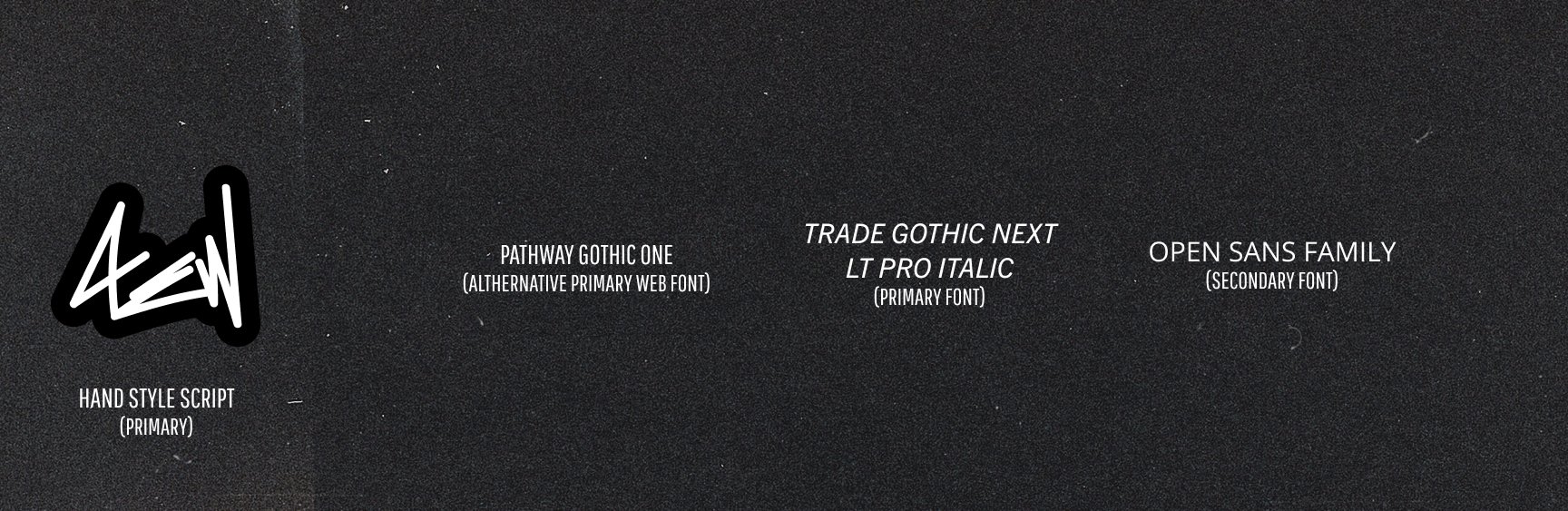

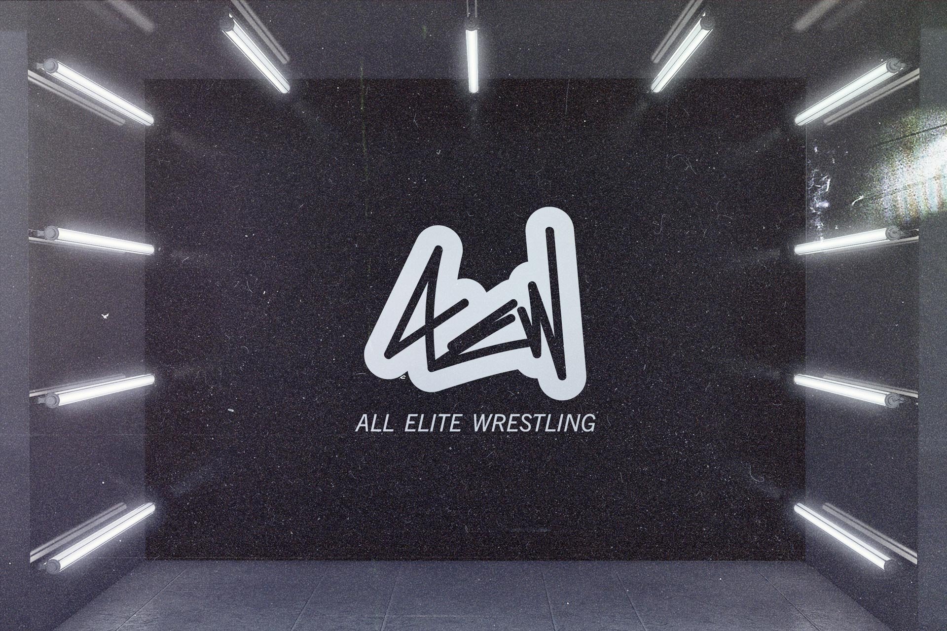
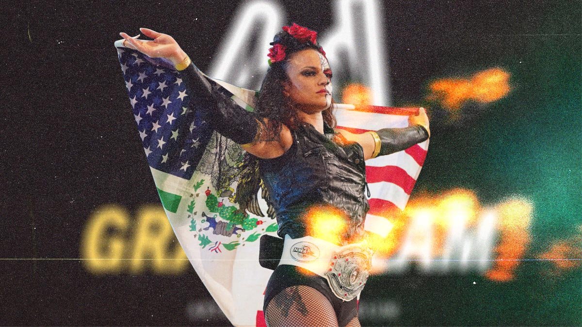
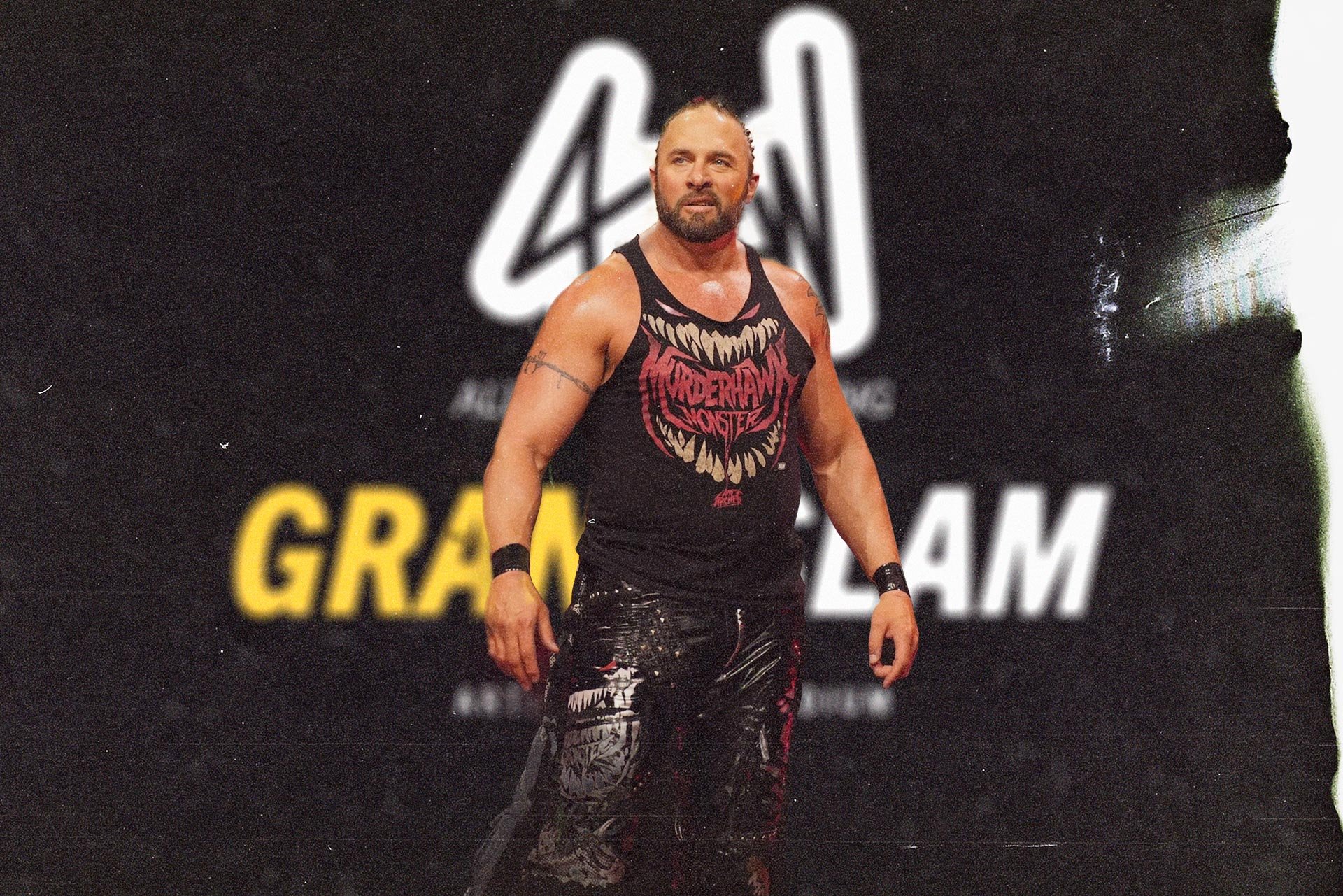
All Elite Wrestling (AEW)
Rebrand exploration
My main approach taken to create new AEW branding had to involve the following pillars:
- Think outside the box to differentiate branding that is outside of AEW’s core industry.
- Create branding that is distinct & adaptable that can cross pollinate across different industries such as streetwear & sports apparel.
- Create an organic image with a recognizable silhouette that is distinct & can stand alone.
- Construct an image that goes against the grain of how one thinks of established promotions in AEW's principal industry (Professional Wrestling).
- Embrace the use of film grain on all photographs to establish a common thread that ties in the organic nature of the new logo to how the overall brand is visually represented.
This is a personal creative project exercise that sought to explore rebranding the current brand of All Elite Wrestling (AEW). My main intention was to rethink how the brand could be repackaged in a more contemporary & progressive way.
Tools used:
Figma
Adobe Creative Suite
Photoshop
Illustrator
view more on BEHANCE.


Rover.com
Graphic Design
Brief
From Mid March to June 2022, I worked with Rover.com as a Contract Graphic Designer. During this time, I was responsible for providing graphic design support for the Rover brand studio department. I helped the team of talented designers produce a high volume of graphics for deliverables such as mobile/desktop newsletters, landing pages, banner ads and print collateral.
Tools used:
Figma
Adobe Creative Suite
Photoshop
InDesign
Illustrator
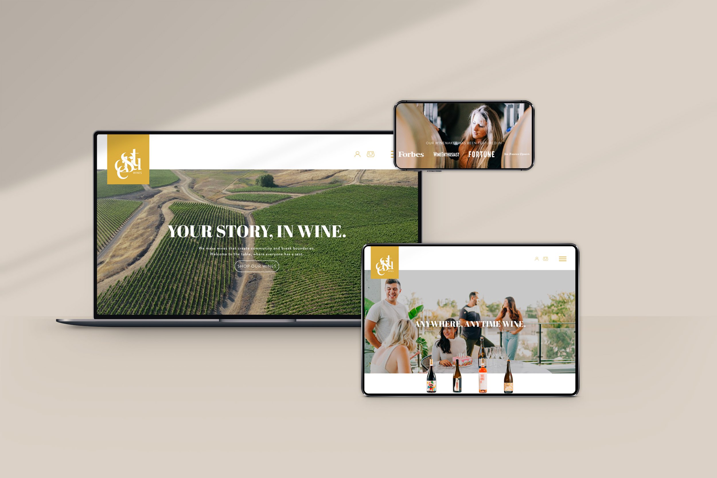
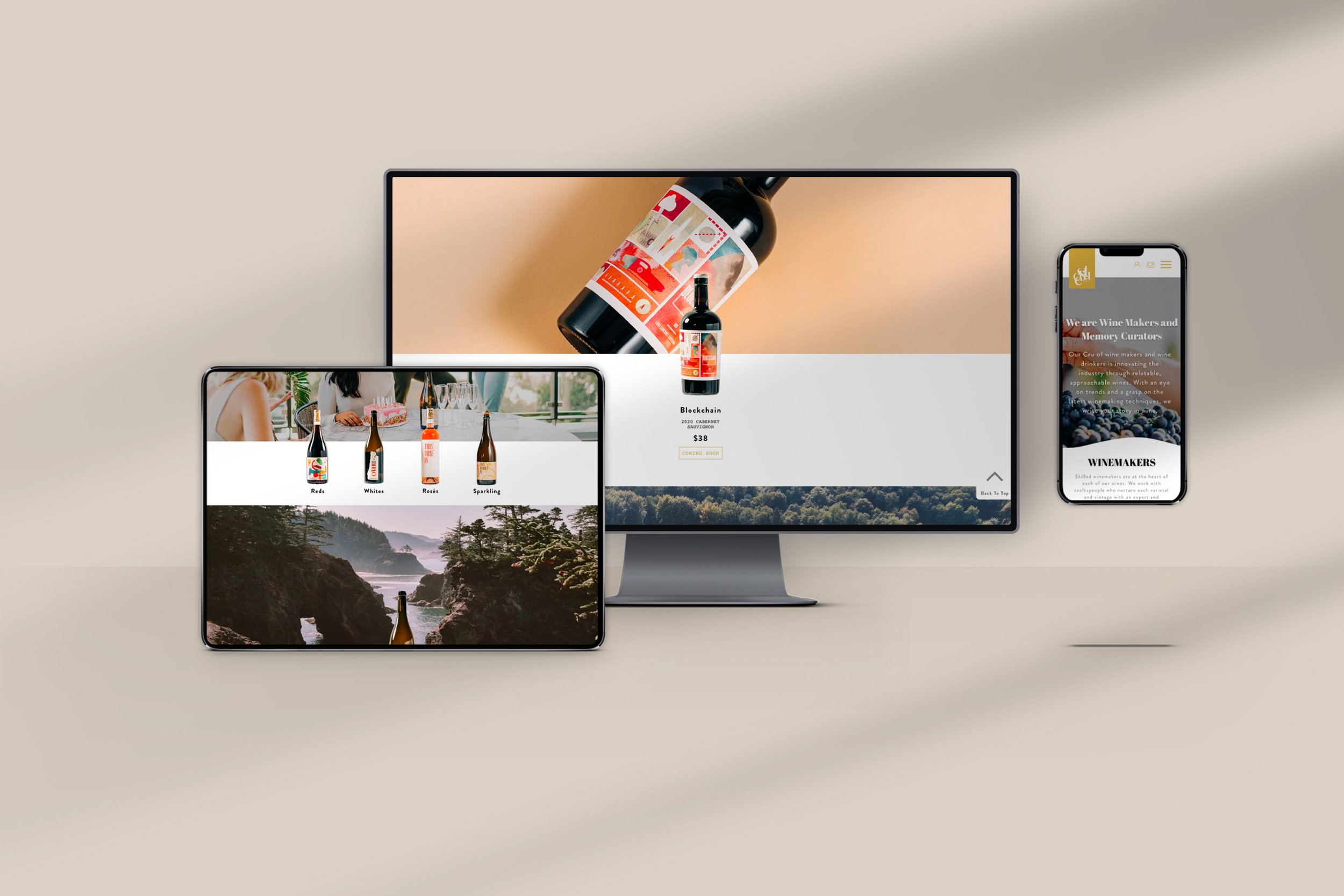
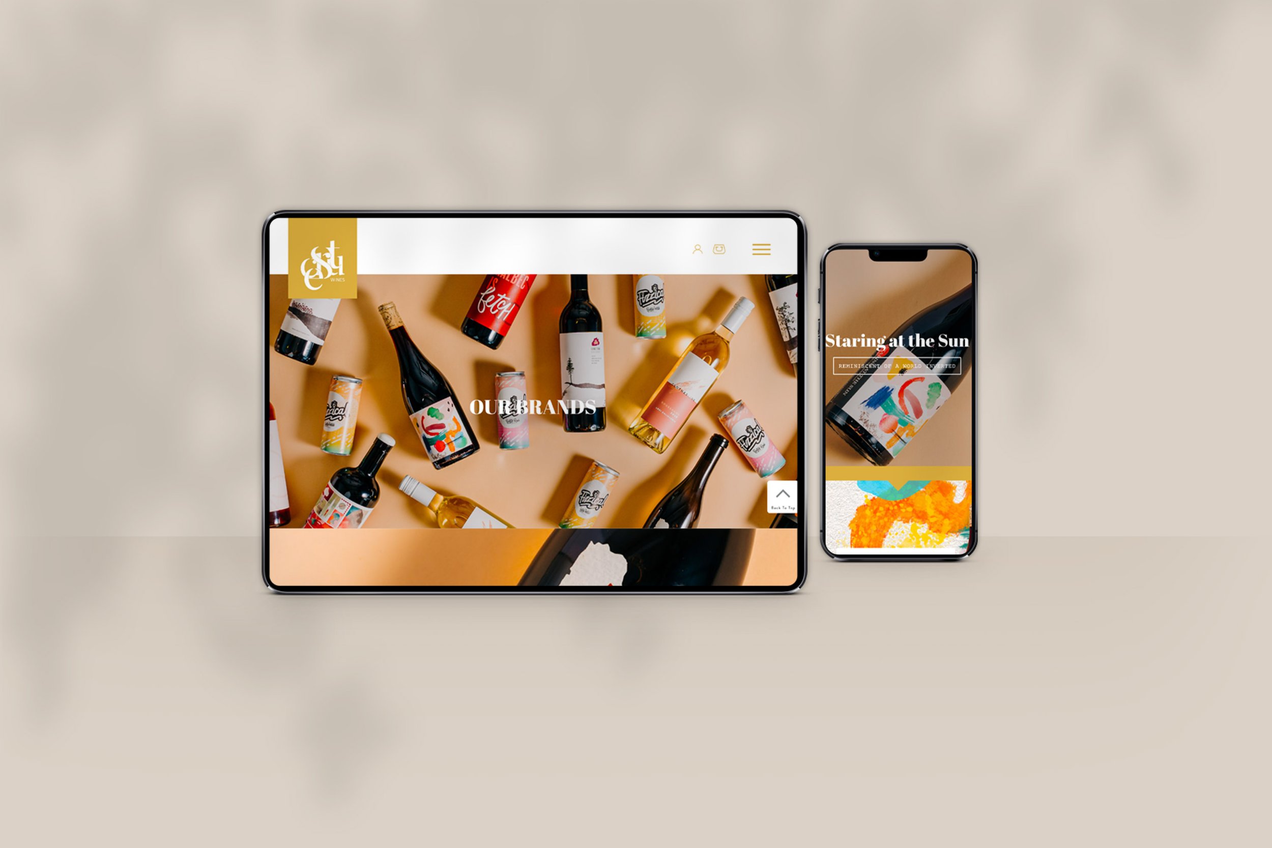
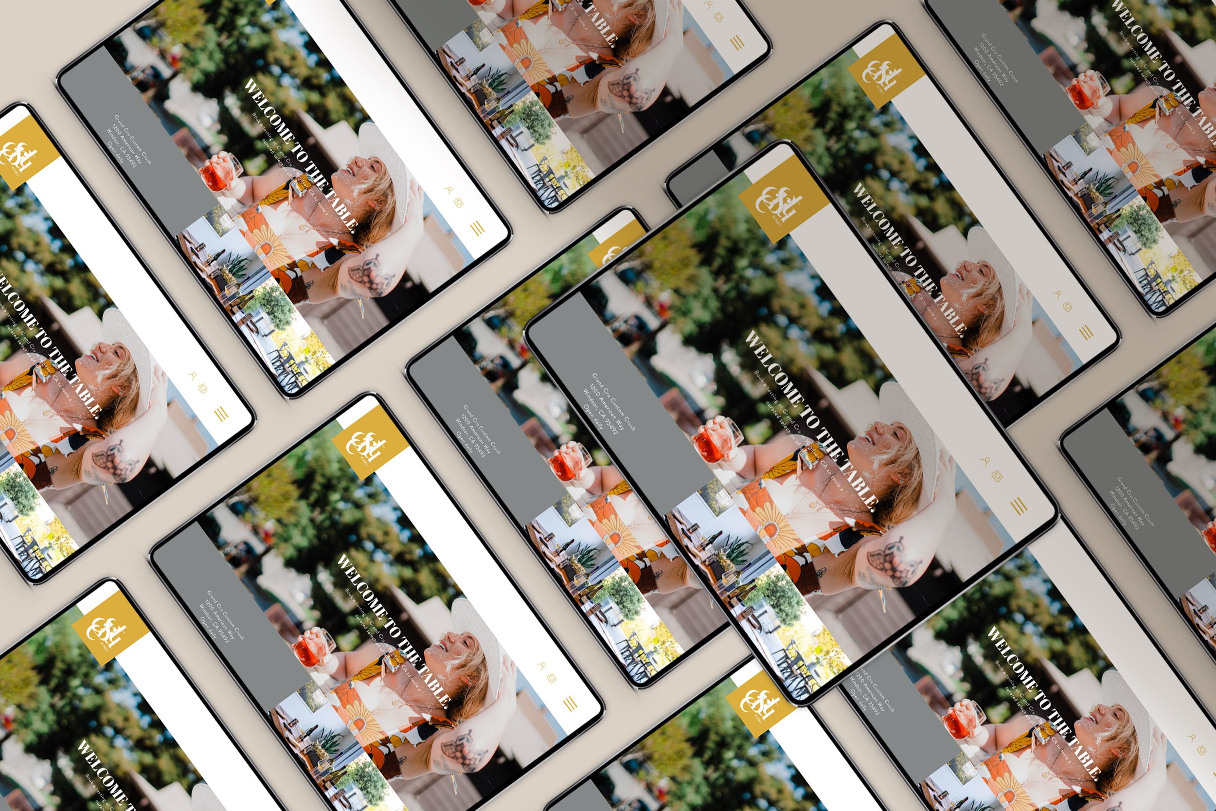
EstCru.co
WEBSITE DESIGN
Sacramento based Wine Makers eStCru, approached my agency CWD Seattle to design an engaging and beautiful home for their line of in house wines and individual product lines. I created a comprehensive design umbrella that delivers on presenting their differentiated brand and product information. In addition to, a central home for eStCru to offer their product line direct to consumers in a user-friendly ecommerce layout.
The design process roughly took 2 months for the front page design. eStCru wanted CWD Seattle to create a full site showcasing all of their content during the design phase. This was to expedite the site launch went sent off to development for coding.
My role in the project was responsible for the front end design end and code support. But the bulk of the code & development heavy lifting was done with another firm hired by eStCru, Thescube.
Tools Used:
Figma
Adobe Photoshop
Adobe Illustrator
Adobe Lightroom

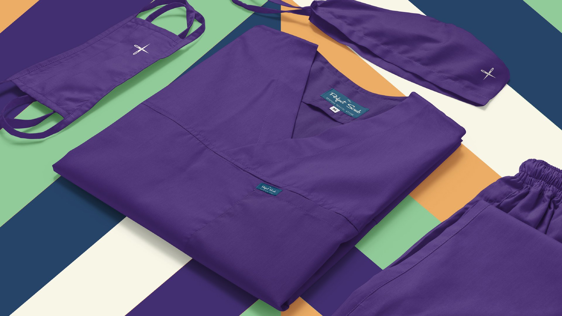
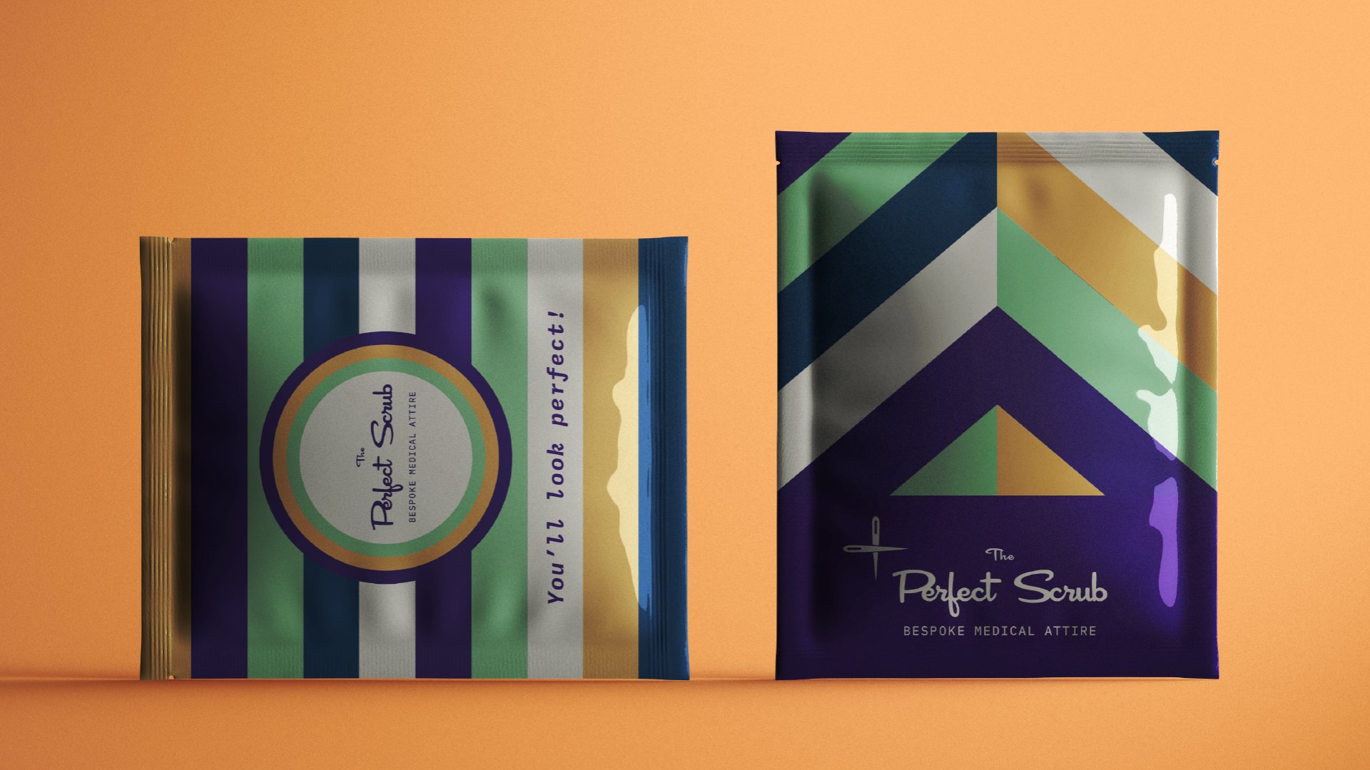

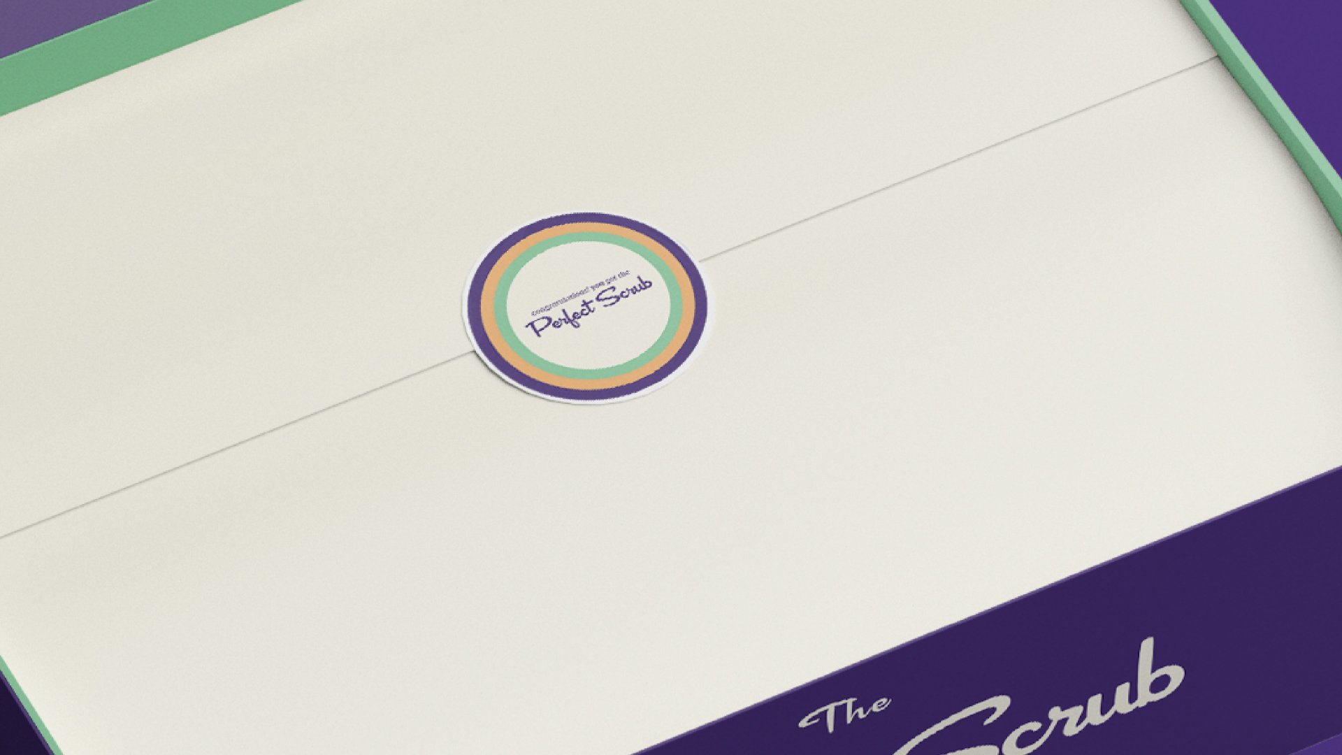
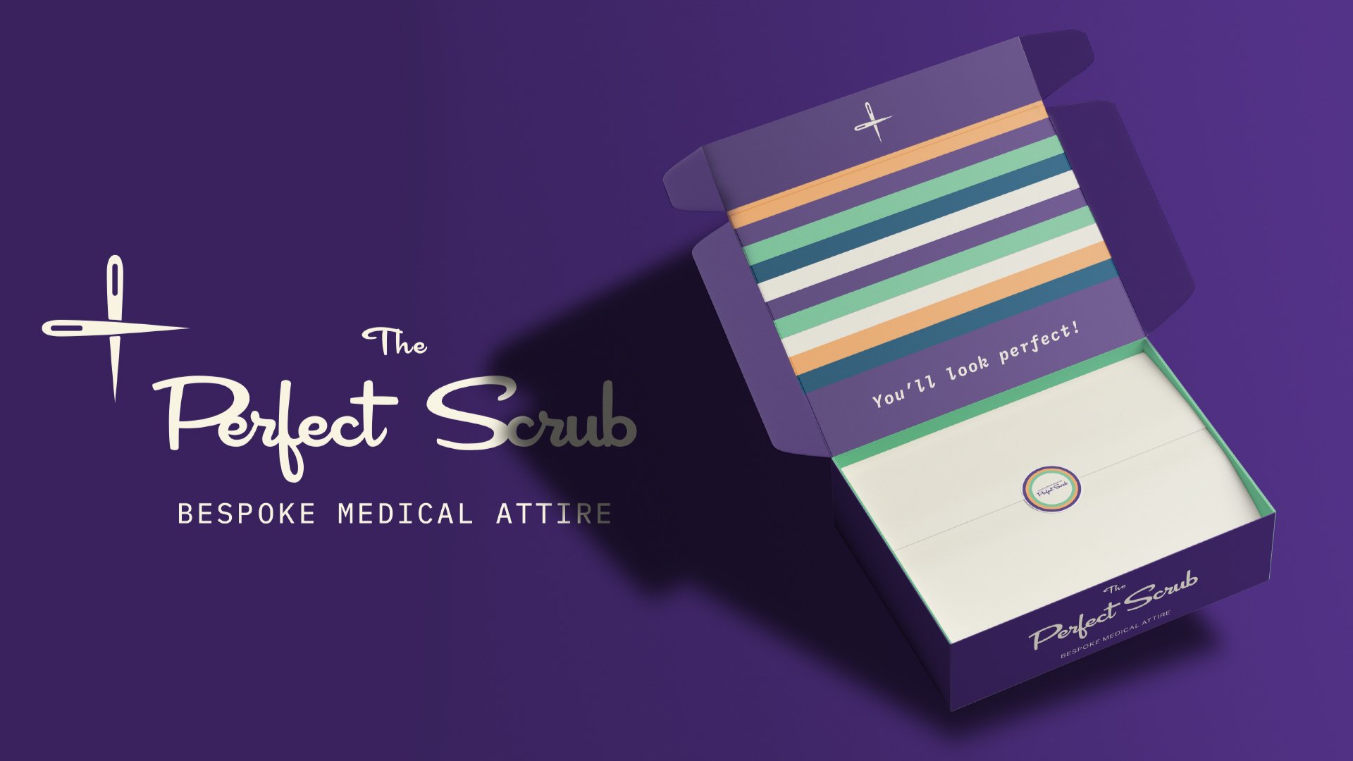
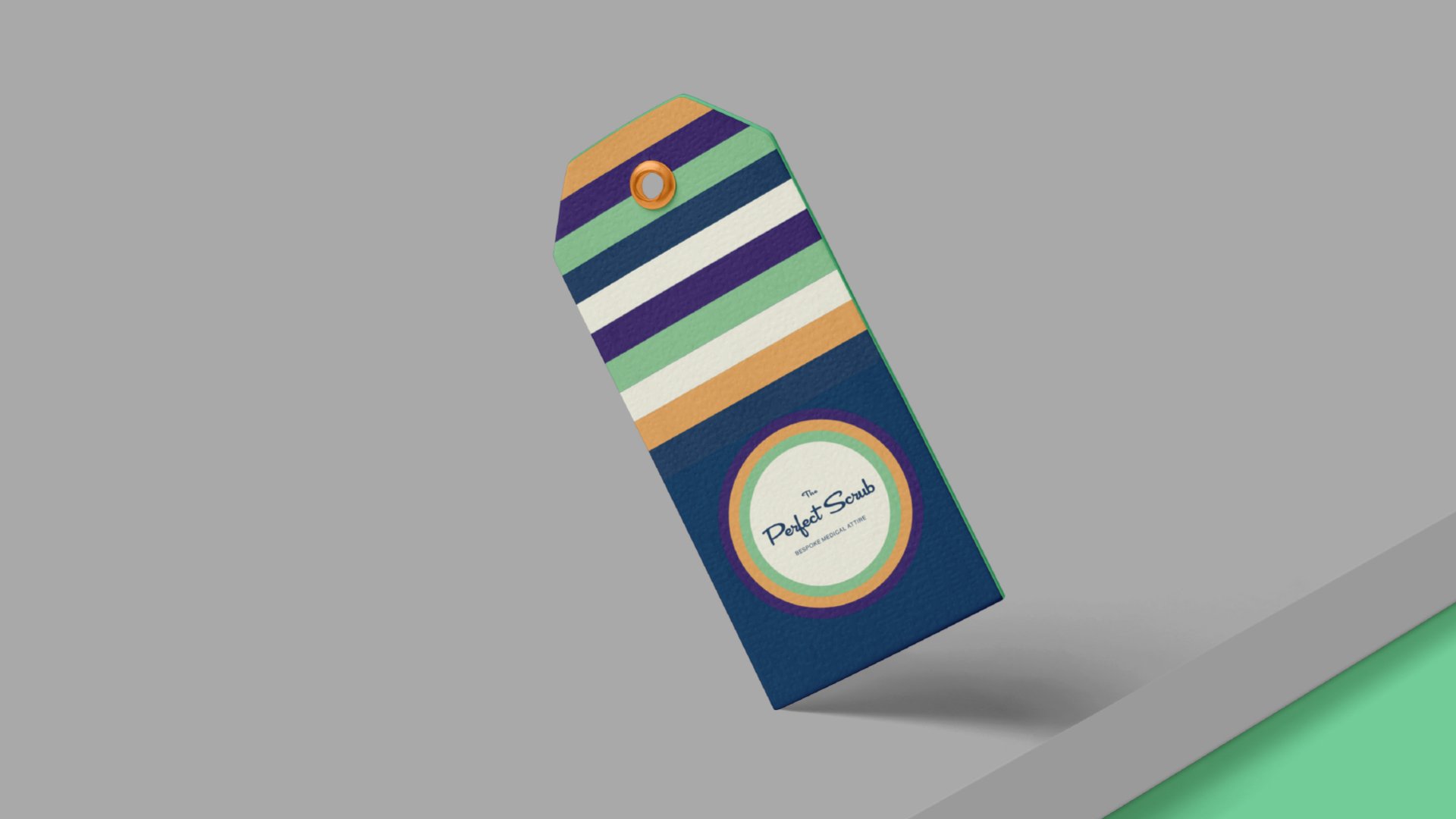
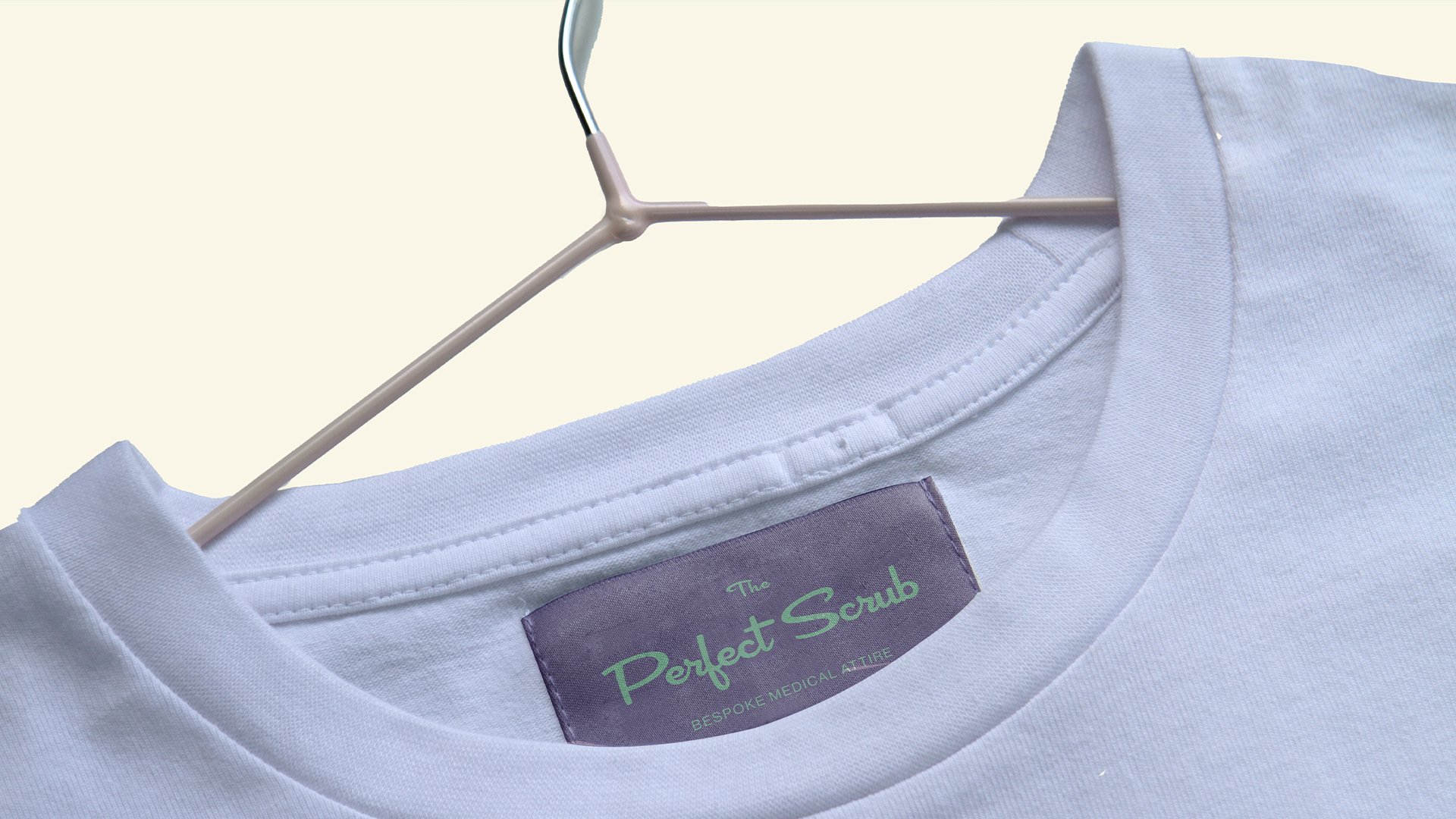
The Perfect Scrub
BRAND DEVELOPMENT
I was hired by Clever Wolf Digital Seattle (CWD Seattle) in July of 2021 and one of our first projects together was developing the brand for The Perfect Scrub.
The idea for The Perfect Scrub is a bespoke uniform service targeted to medical professionals, tailored to their specific measurements and body types. I was tasked with creating the brand that is unique to The Perfect Scrub that enables the service to stand apart from their competitors operating in the same space. I chose to design a brand that adheres to a mid century modern aesthetic, but evokes a sense of fun and gives a sense of quality that is non exclusive and approachable. The mockups seen here give a sense of how the product should be delivered and presented to the customer. The main premise is to let the customer feel a sense from the company initially though digitally to when it reaches their doorstep.
Tools Used:
Adobe Illustrator
Adobe Photoshop
Adobe InDesign
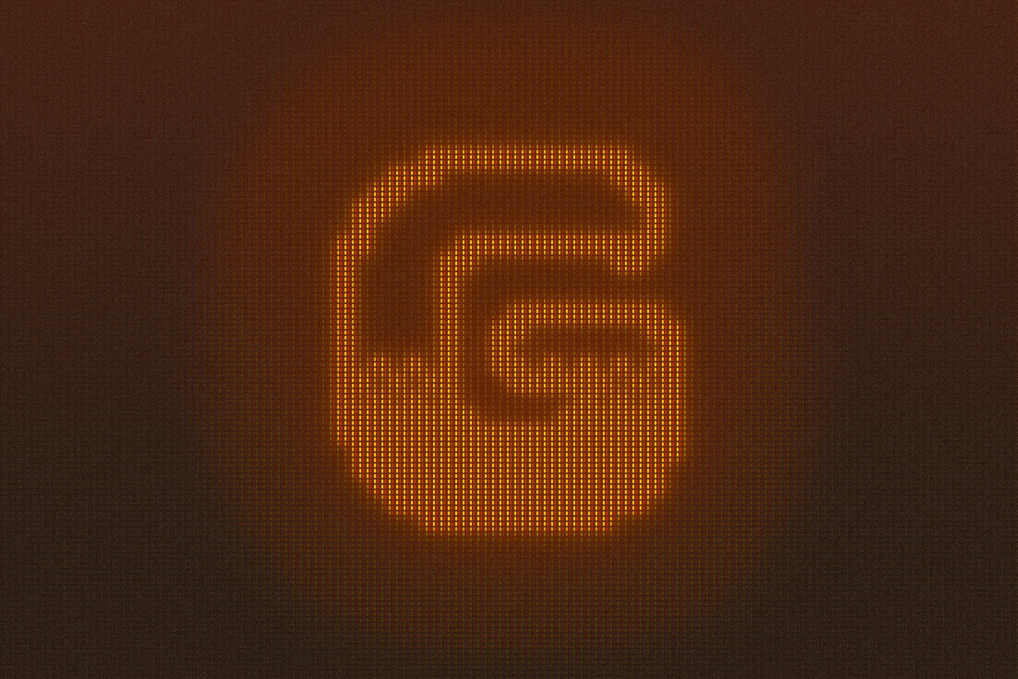
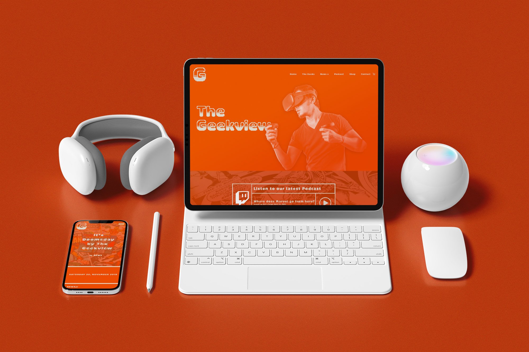
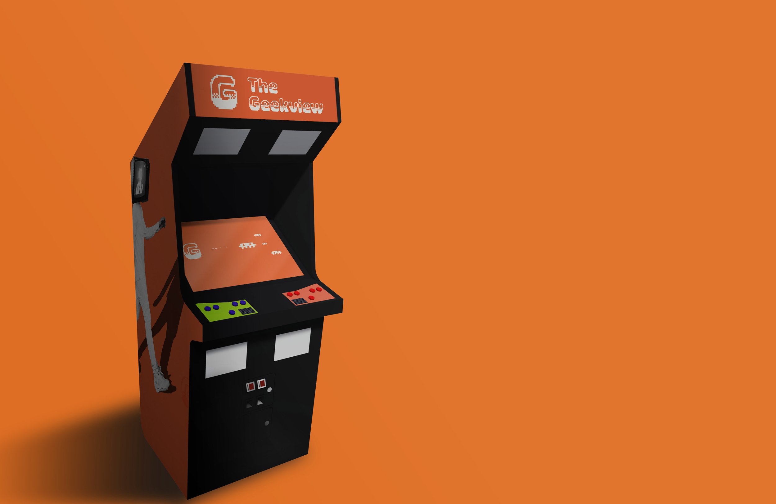
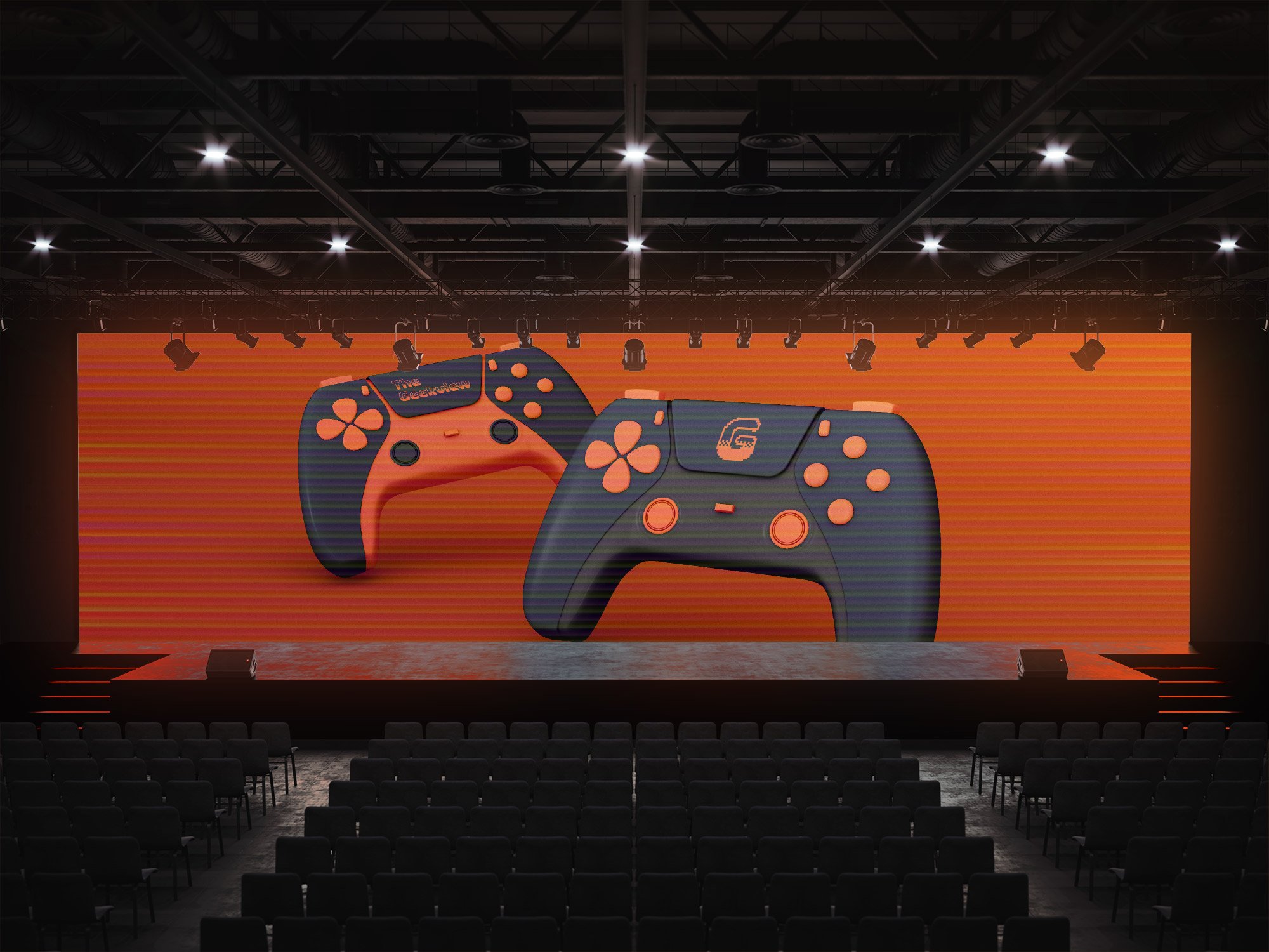
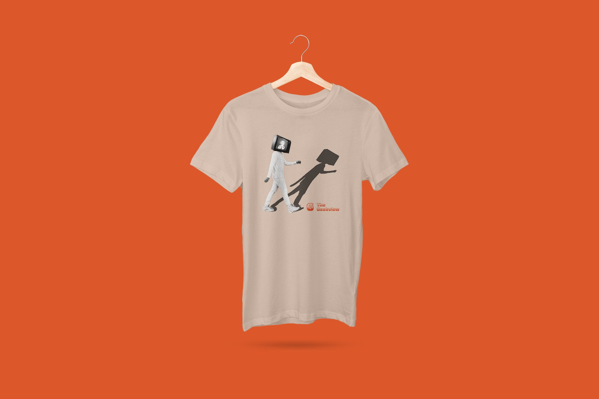
The Geek View
Branding and website development
The Geek View is an internal project from CWD Seattle. This project is meant to be a multimedia outlet discussing all things in Geek Culture. I was tasked with creating a visual brand that is easily recognizable, modern but also embraces retro cues. I centered the brand logo to pay homage to 8 bit video games, but chose to make the brand mark a simple pixelated letter “G”. The orange colors were chosen as a means to differentiate the brand with a distinct and vibrant color pallet.
The website design UI chose to have a feeling of a comic book panel and utilizes large type fonts that match pixelated “G” brand mark. Overall, these designs were chosen to represent the branding to The Geek View’s audience. After the front end design was developed in Figma, design files were presented to our internal development team for coding. The Geek View website is currently under development and will release sometime in Spring 2022.
Tools Used:
Figma
Adobe Photoshop
Adobe Illustrator
Adobe Lightroom
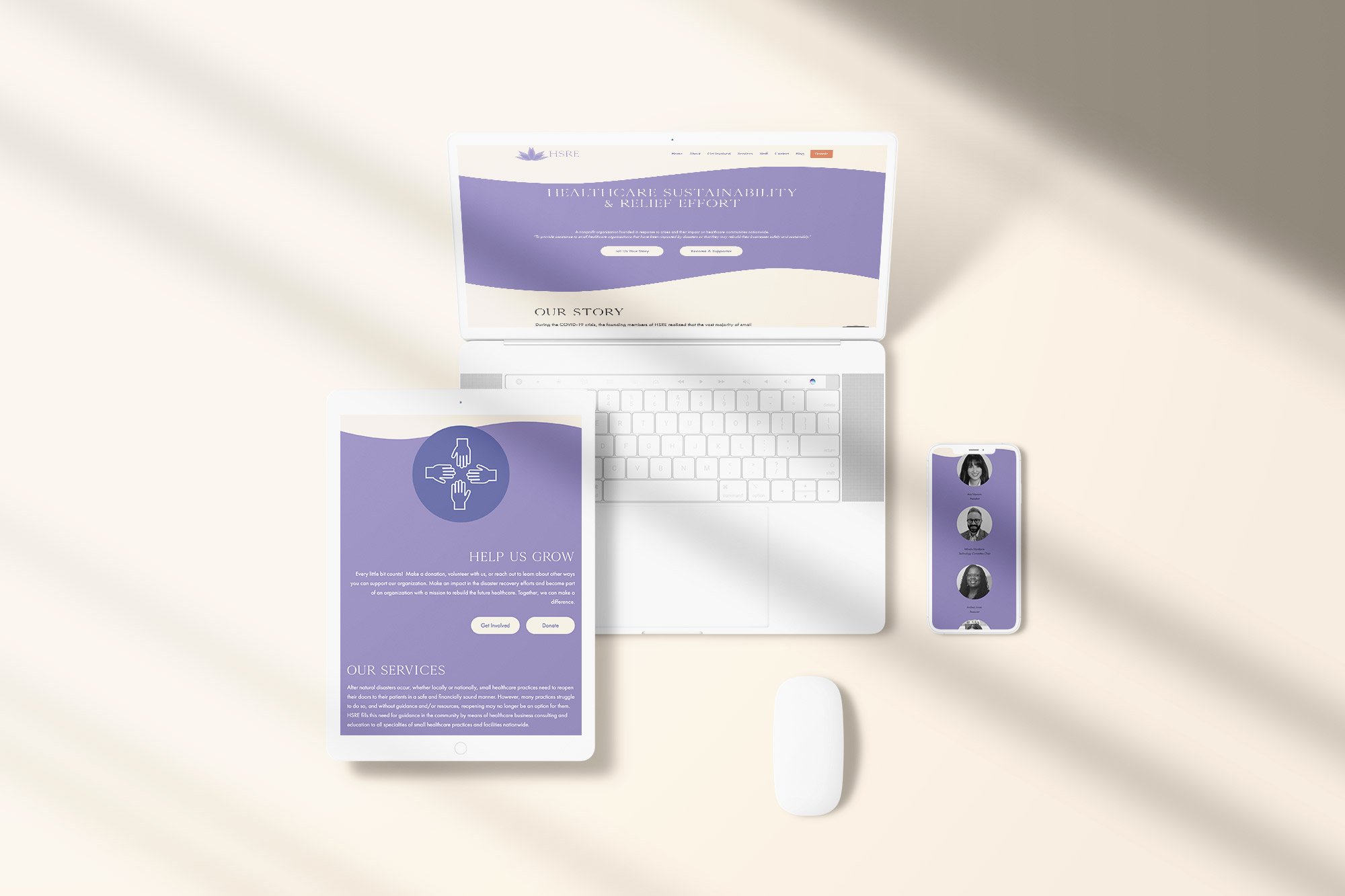
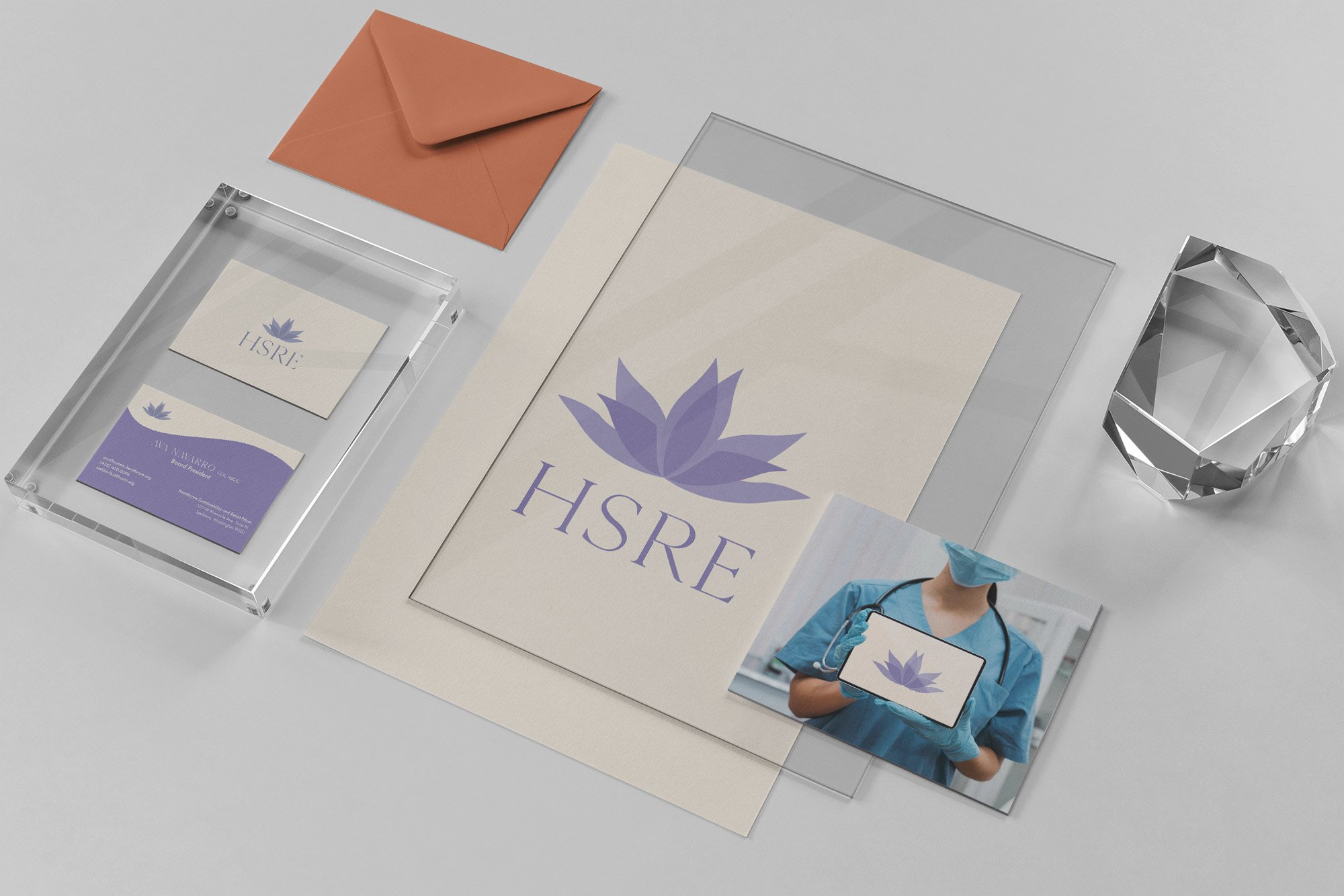
Healthcare Sustainability & Relief Effort
Branding and website development - volunteer
The pandemic led me to volunteer my services to great organizations pursuing efforts to help others in need. During this time, I was fortunate enough to help HSRE (Healthcare Sustainability & Relief Effort) create a brand and organize their efforts. As a volunteer, I worked directly with the CEO of the Nonprofit rebrand their organization into a look that’s contemporary, inviting, friendly and distinct.
I also worked on developing the front end of their new website that is more on brand and full servicing. We targeted the main content to be on the front page so information and engagement can be easily accessible to their audience. After front end development was completed, I collaborated with HSRE’s volunteer web developers to code and launch sustain-healthcare.org
HSRE is a service created to help Mid-Small Healthcare organizations through crisis situations such as the pandemic and natural disasters.
Tools Used:
Adobe XD
Adobe Photoshop
Adobe Illustrator
Adobe Lightroom
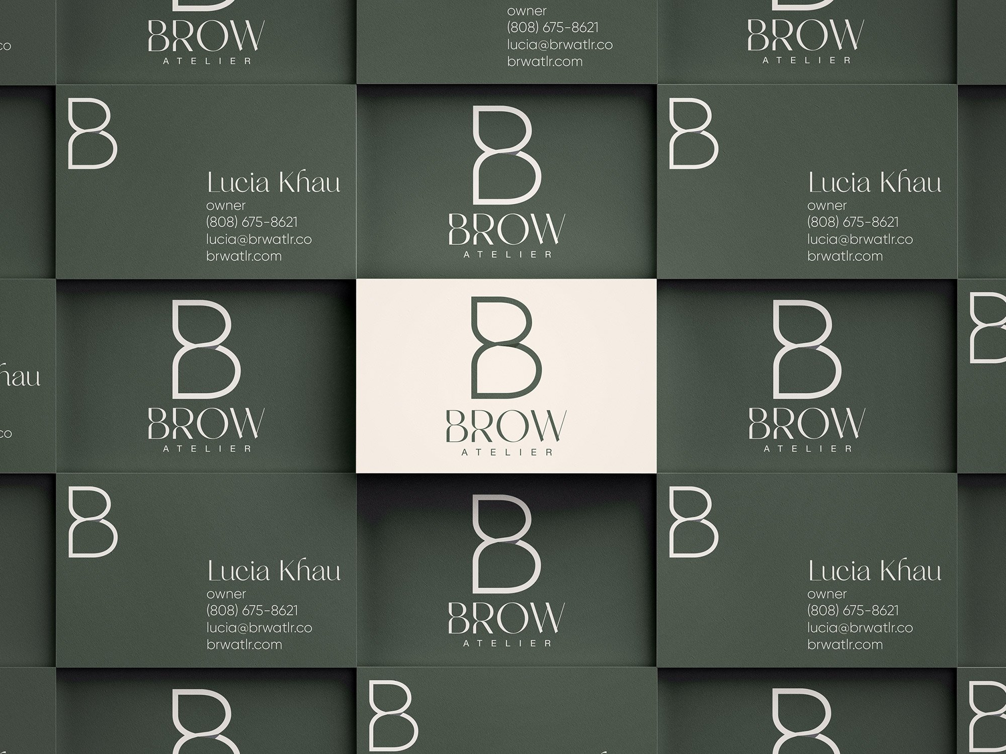
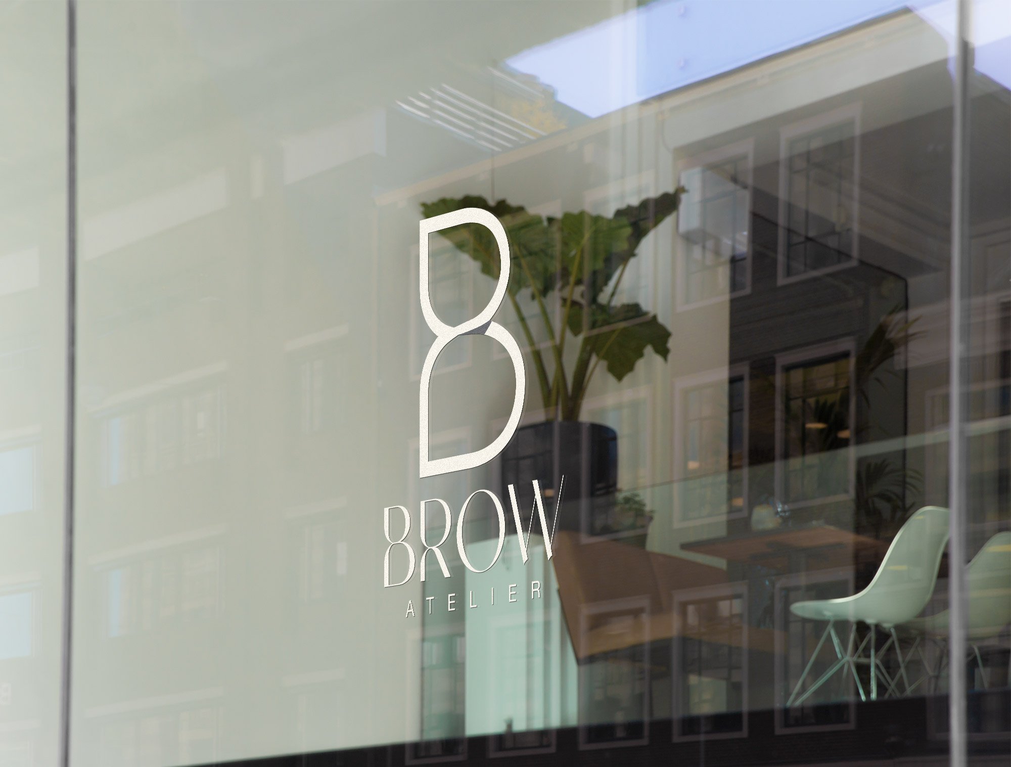
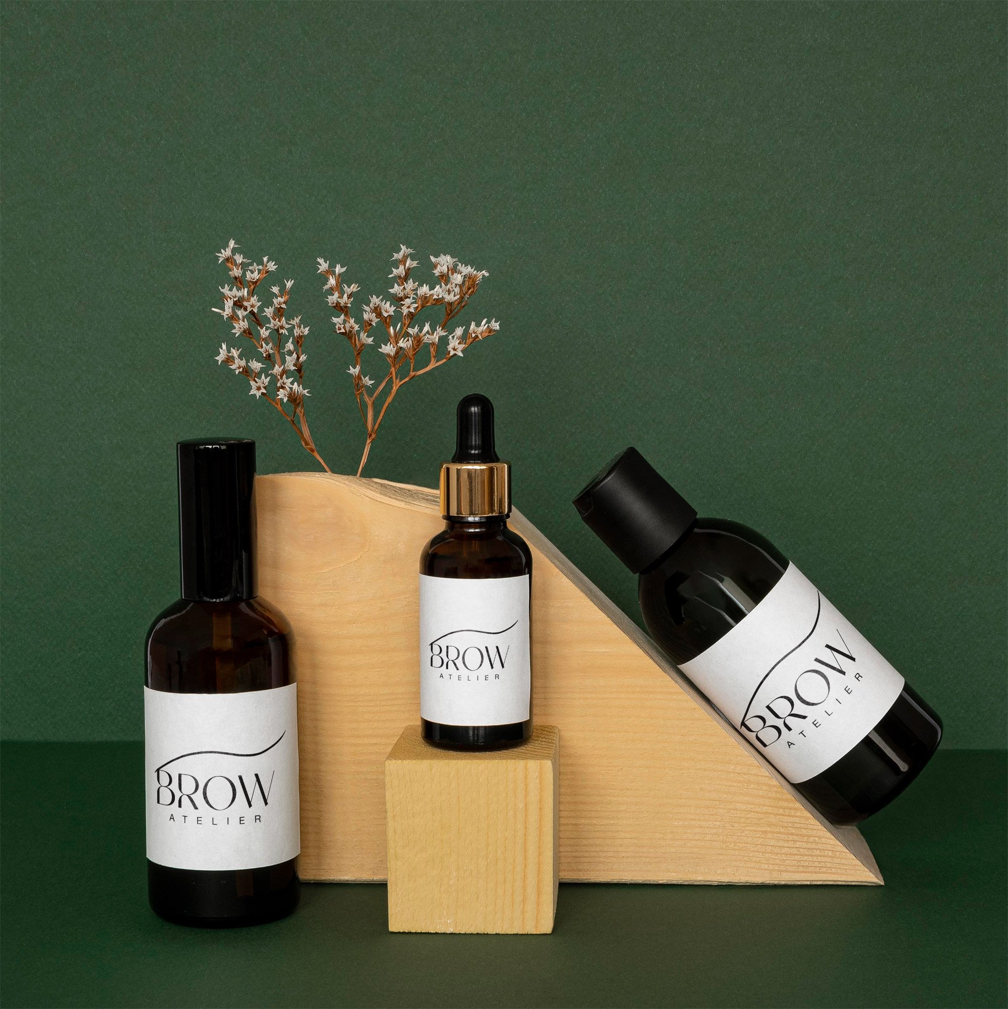
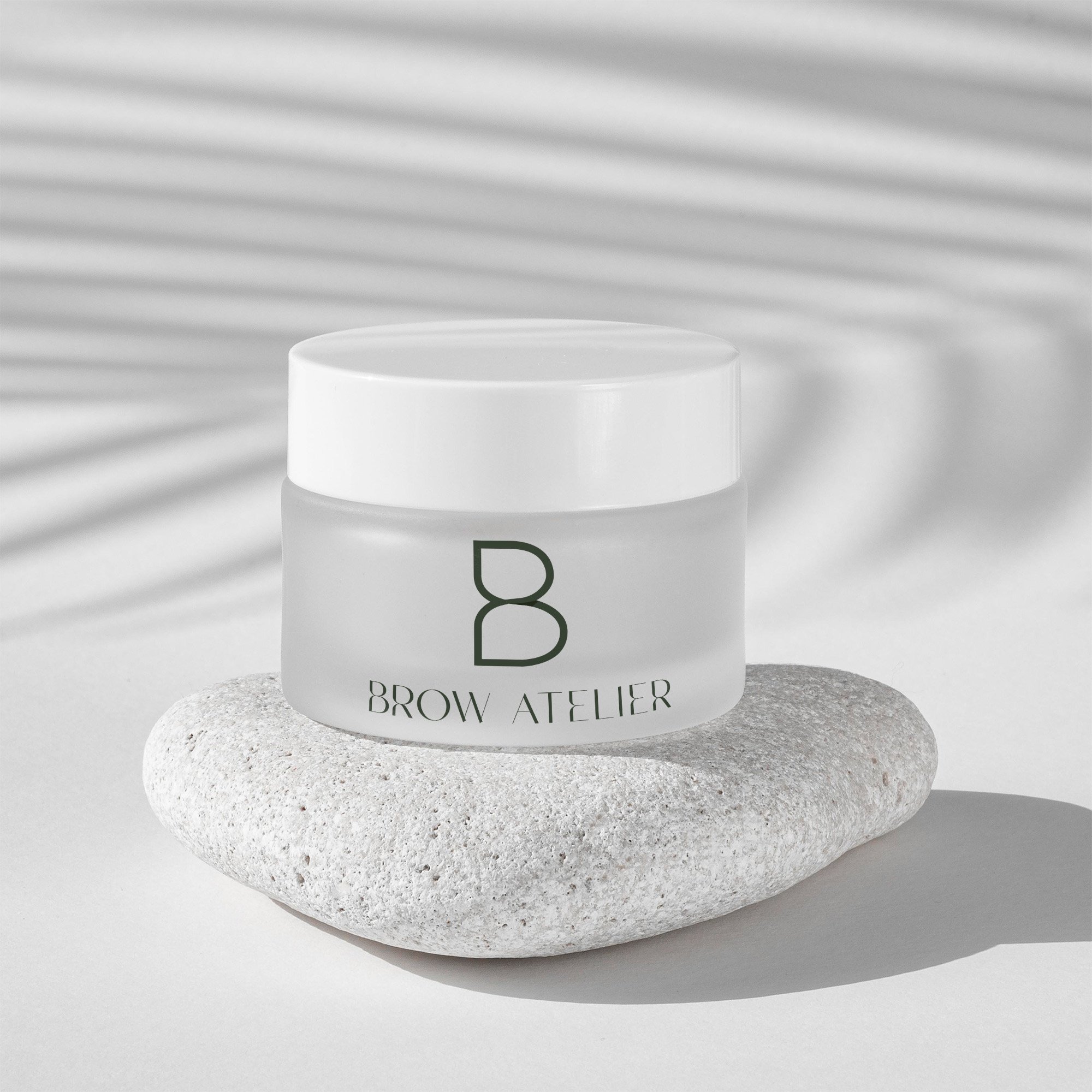
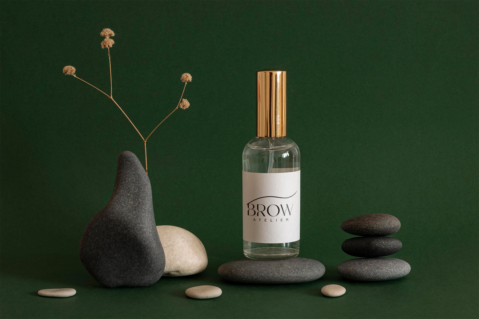
Brow Atelier
BRAND DEVELOPMENT- VOLUNTEER
During the pandemic, I donated my services to help my friend develop branding for Brow Atelier. Lucia sought to create a design that is timeless, classic but grounded logo that gives a sense of class and approachable prestige. I used inspiration from an Audrey Hepburn quote to craft a perfect aesthetic for her:
“For beautiful eyes, look for the good in others; for beautiful lips, speak only words of kindness; and for poise, walk with the knowledge that you are never alone.”
Tools Used:
Adobe Illustrator
Adobe Photoshop
Adobe InDesign

Carpenter Group, NYC
SEI FiNANCIAL
In 2017 & 2018, I was commissioned by the Carpenter Group to create artwork for their SEI Financial campaign. I was directed to create a mind-bending surreal world art piece as a means to draw in the target audience and to emphasize possibilities through imagination.
Tools used:
Adobe Photoshop
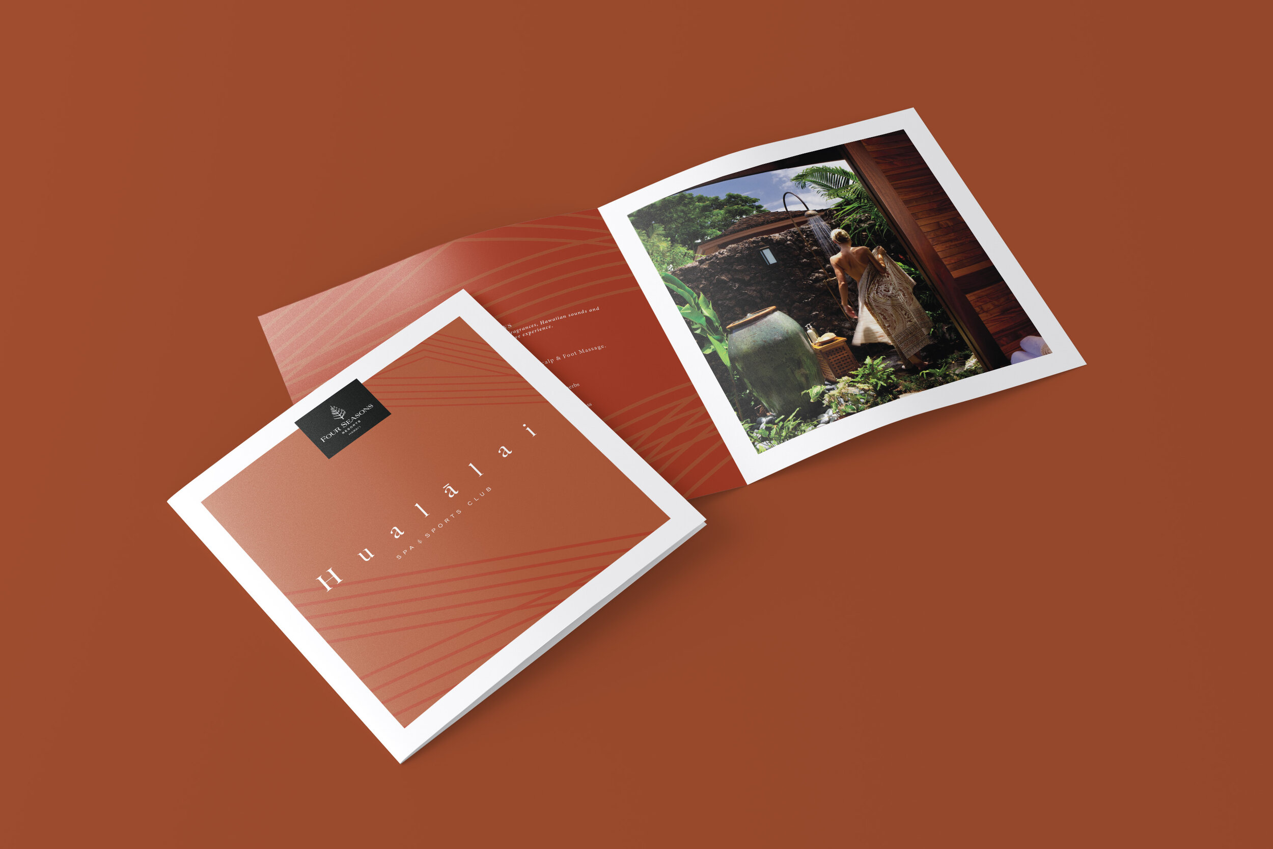
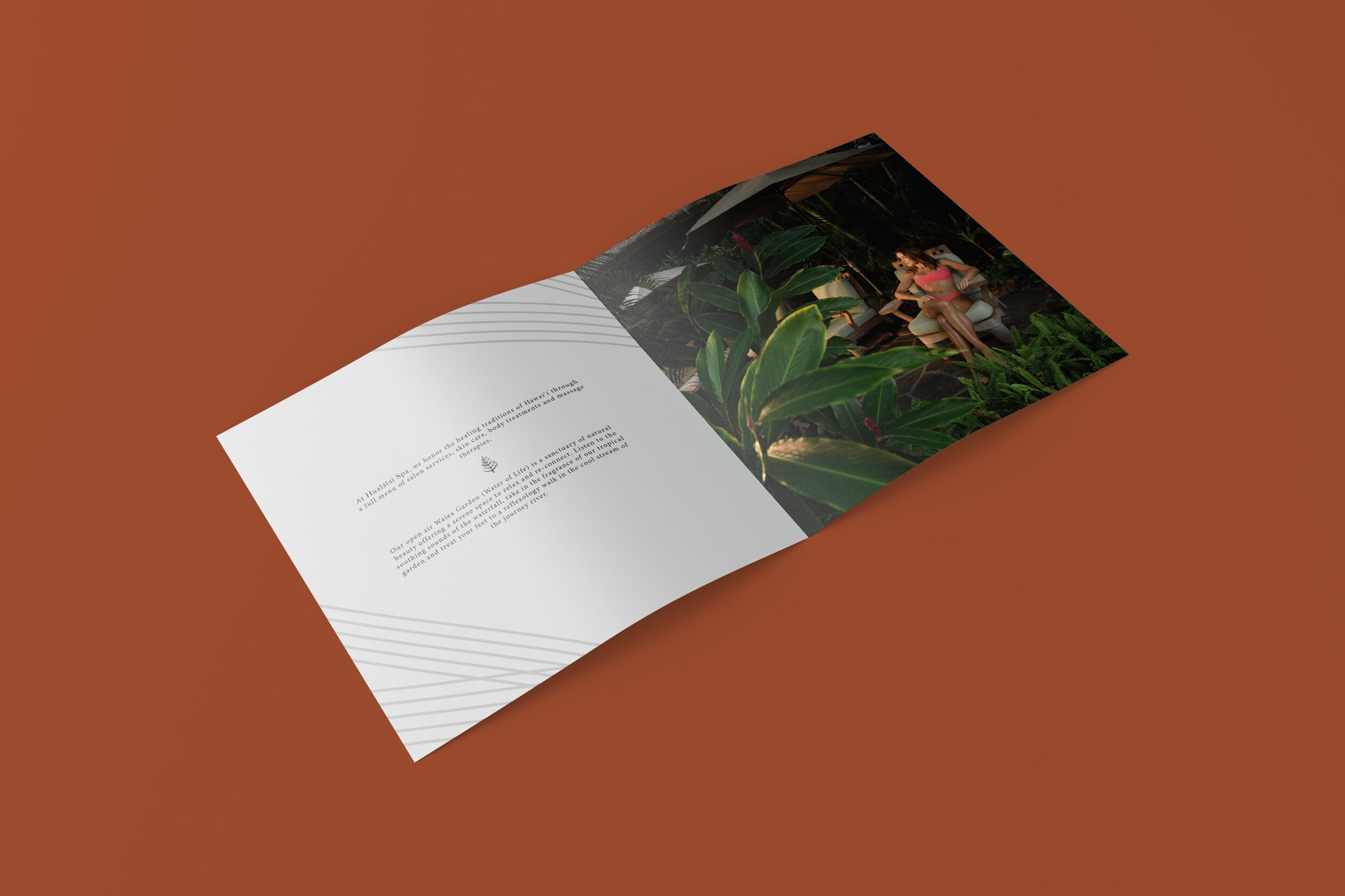
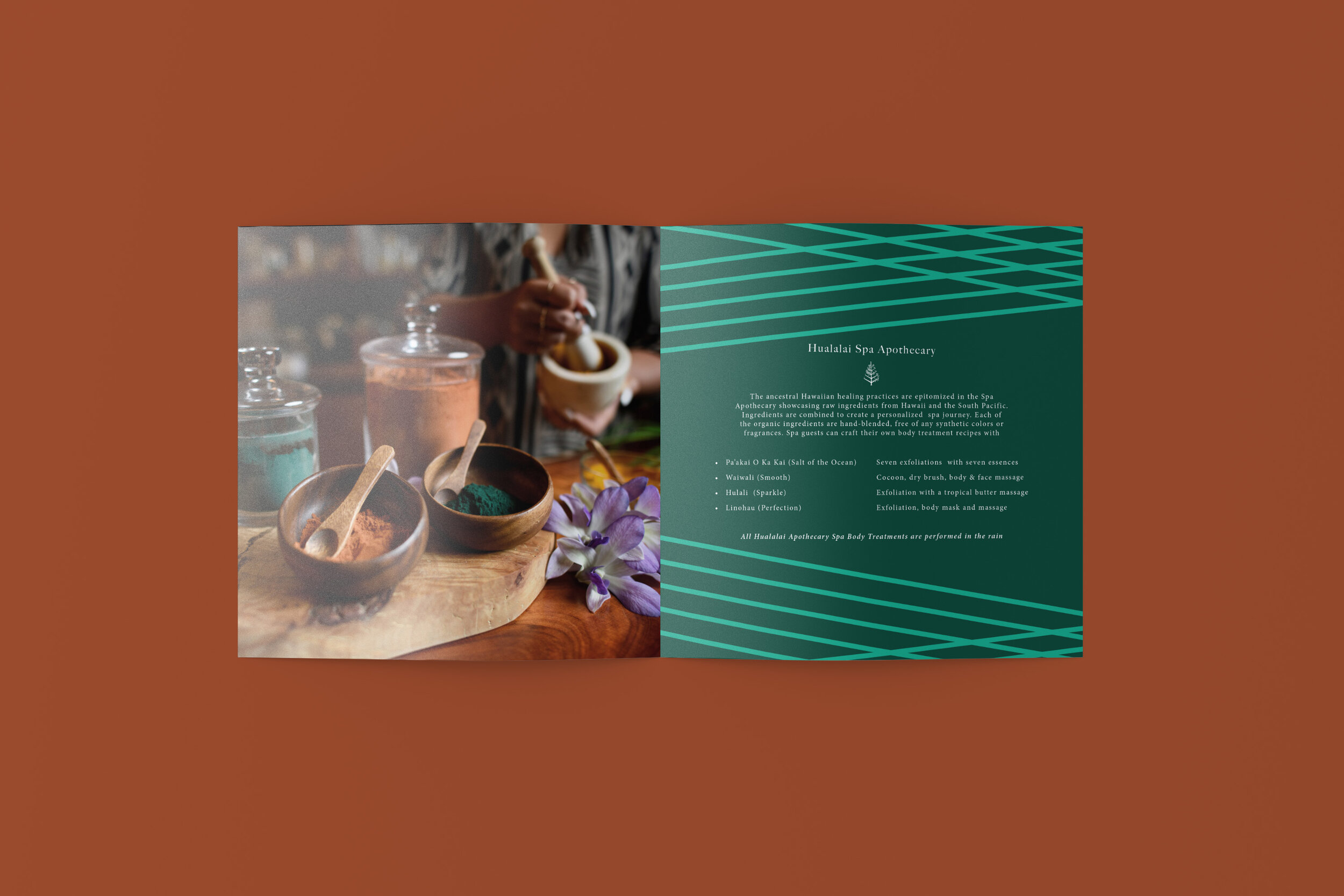
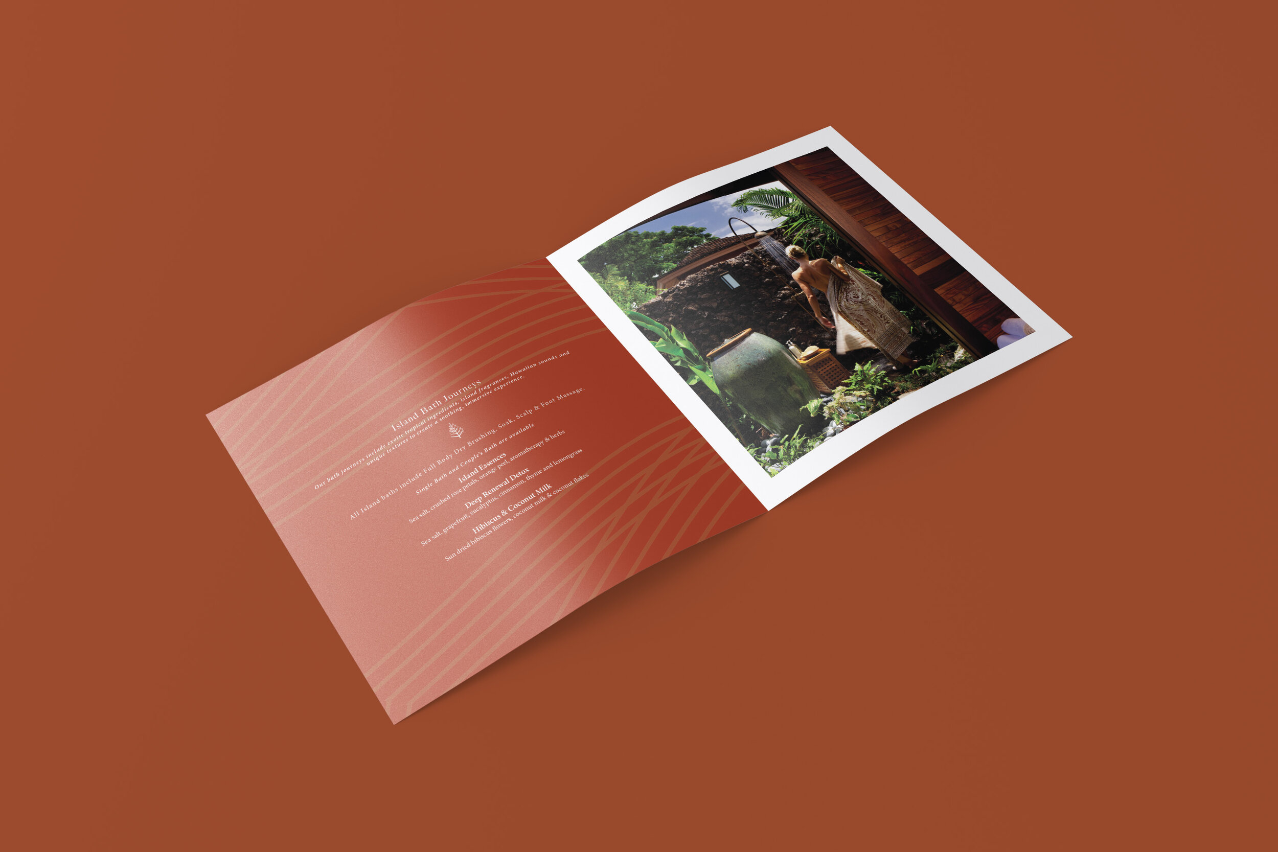
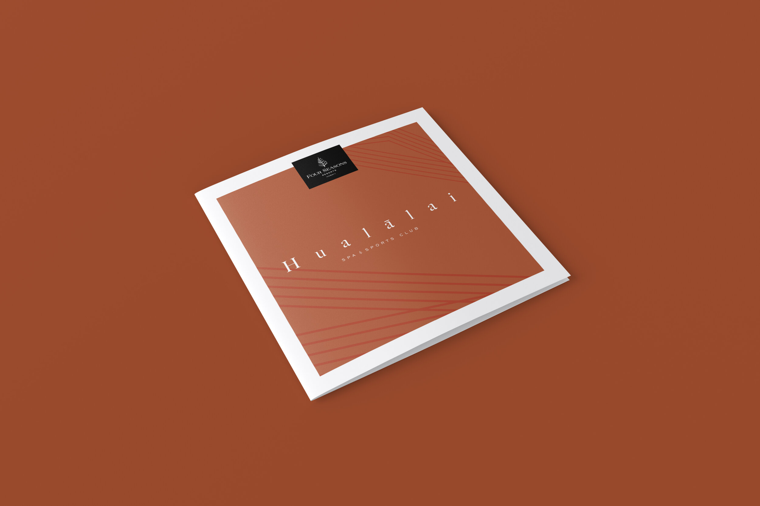
Four Seasons Hualālai
CONCEPT DESIGNS
Brief
I was asked by Four Seasons Hualālai to design a concepted brochure for their SPA and treatments, to recharge their current service offerings to guests. Although this design was ultimately not selected & they chose to go with an internal corporate asset instead, I still had a tremendous time communicating with the Four Seasons Hualālai spa team regarding their services. I wish them the best success for the future!
Tools used:
Adobe Creative Suite
Photoshop
Lightroom
InDesign
Illustrator
Acrobat

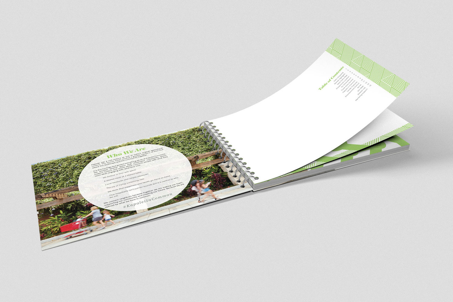
Note: the above graphic is a rough mockup of what was created for Kauai Beach Resort. It does not accurately represent the final product.
Kauai Beach Resort
Pocket Map Graphics
I was approached by Kauai Beach Resort a few years ago to update their Pocket Map for guests to use to get around the estates. I worked directly with their Marketing Department to pinpoint the exact locations of their directory. The challenge was creating the map graphic remotely without never having to been on the property. It took a lot of back and forth between myself and the marketing department to accurately plot the layout of the resort. Ultimately, we were successful at creating the updated graphic for their guests to use.
Tools used:
Adobe Illustrator
Adobe InDesign


Kapolei Commons
Leasing Book
Brief
Kapolei Commons approached me with this project to redesign an impactful attention grabbing retail brochure to attract new tenants.
Problem
The task was to incorporated all information and statistics in a short-form way for quick proposals during their one on one interactions with potential tenants.
Solution
I designed infographics as well as short-formed the desired info as designated by Kapolei Commons. They wanted as much information packed on each page, presented in a clean manner.
Tools used:
Adobe Creative Suite
Photoshop
Lightroom
InDesign
Illustrator
Acrobat


Bondi 38
CONCEPT Rebrand
Brief
This concept for Bondi 38 was a personal challenge project. I researched cafes in Sydney Australia and sought to re design a rebrand for existing cafe’s which could use a face lift.
I selected Bondi 38 Coffee - researched a bit of their history and customer demographic. I ultimately chose this teal and seafoam colorway to perfectly embody Bondi’s cultural aesthetic. The misaligned typeface was then designed to give a sense of refined but playful language that is personified by their culture. 38 was housed in a “cup” as the brand mark for their coffeehouse.
Tools used:
Adobe Creative Suite
Photoshop
Lightroom
InDesign
Illustrator
Acrobat

Malibu Beach House
CONCEPT branding
Brief
As with Bondi 38, another conceptual project I worked on was for the Oceanfront Malibu Beach House. I discovered this establishment years ago when I lived in California and thought it could use a modern rebrand. I did not want to deviate away from their classical look and feel.
Therefore, I sought to pay homage to their history by delivering this straight forward, polished typeface. The point of this rebrand was to evoke a sense of timelessness, which would be prevalent to any era. As the saying goes…
”Classics never go out of style”
Tools used:
Adobe Creative Suite
Photoshop
Lightroom
InDesign
Illustrator
Acrobat

Art + Flea
branding + Japanese style promo video
Brief
In 2013, Art + Flea was in need to create a brand mark that encompassed their spirit. The A+F design was created to to perfectly embody the whimsical and fun nature Art + Flea was known for. The intent of the design was to be fully adaptable and unstructured. Art + Flea at the time was known for their monthly themed events. This brand marked sought to service to ever-changing look and feel, so it may flow freely between these events.
This video was created to cater towards the wonderful Japanese tourists who frequent our island. Alyssa Wooten was tasked to be the face and host highlights of our marketplace in Japanese. Christopher Balidio and Mark Mizusawa along with myself helped film Alyssa’s journey throughout our market. Aly Ishikuni provided our translations. After principal photography was done, I worked on the edit and overlaid the Japanese translations over with the guidance of Ms. Ishikuni. I made sure to capture the spirit of Japanese media (which fits well with the spirit of Art + Flea at the time). In addition, was able to create fun, imperfect graphics that matched with the tone of the marketplace. Overall this effort afforded our group to grow and work with the likes of JTB, and helped us host an installation of our marketplace at Honolulu Festival at the Hawaii Convention Center for years to come. Additionally, we were able to grow our market locally by travelling to different venues on the island to host our events.
Tools used:
Adobe Creative Suite
Adobe Illustrator
After Effects
Premiere Pro